Transforming Medicaid Plan Shopping: A 40% Boost in User Confidence Across 48 Markets
The goal of this project was to enhance the Medicaid shopping experience across
uhccp.com by redesigning state-specific Medicaid pages to better support the acquisition journey. Our mission was to help users feel confident when selecting the right health plan for themselves and their families across 48 markets. (Enhance the Medicaid plan shopping experience across uhccp.com).
Goal
Our goal was to improve the Medicaid plan shopping experience on UHCCP.com, helping users easily find and choose the right health plan for themselves and their families across 48 markets.
Timeline
● Conducted a six-week UX assessment to identify key usability and content gaps across 48 state Medicaid pages.
● Developed a streamlined UX strategy focused on information architecture, design consistency, accessibility, and SEO improvements.
● Performed targeted user and competitive research to uncover insights that informed a scalable redesign for all markets.
My role
UX Lead (Advocate for user needs while aligning solutions with business goals.)
Team composition
Designers, content specialists, developers, PMs, stakeholders, legal, SEO, and UnitedHealthcare Brand experts.
Tools
● Figma (Wireframes, mockups)
● Figjam (workshops)
● Adobe Creative Cloud (Presentations, optimization of photos and illustrations
● Microsoft Teams (Conduct User interviews, workshops)

Problem Statement
Users struggled to understand eligibility and choose the right Medicaid plan due to inconsistent layouts, complex language, and accessibility gaps across state pages. This confusion led to high drop-off rates, increased support calls, and lower enrollment, prompting the need for a consistent, user-friendly, and WCAG-compliant experience.
Project constants
● Included tight timelines
● AEM development requirements
● Client partnership (work with the state Medicaid representatives from the client perspective to support their requirements).
Research & Discovery
I conducted a mix of usability testing, desk research, and data analysis to gather clear qualitative and quantitative insights. This helped uncover user needs, validate pain points, and shape a strong UX strategy grounded in evidence—not assumptions.
To better understand user challenges
● We reviewed analytics to understand user behavior patterns — identifying which sections and CTAs received the most engagement and where users were most active on the page.
● Conducted stakeholder interviews — identifying that “Plan search” and “How to enroll” are the key sections of the user experience.
● Analyzed feedback from call centers and support teams. This helped us identify where users were getting lost and what information they needed most when shopping for Medicaid plans.
We discovered that many users
● Struggled to understand eligibility requirements and state-specific differences.
● Found the content too complex or inconsistent across states.
● We need to simple way to compare plans and feel confident in their choice.
● We also reviewed accessibility reports to ensure our redesign would meet ADA/WCAG compliance. (SEO, 4th-grade reading level)
The current Medicaid state page experience
I analyzed the current experience to understand how users find and understand information when shopping for Medicaid plans.
“These insights shaped our design goals — to create a consistent, easy-to-navigate experience.”
Usability Test Question
Question 1
1. When you arrive on this page, what do you think you’re able to do here?
Question 2
2. Can you find out whether you are eligible for this Medicaid plan? Walk me through how you would do that.
Question 3
3. Look at the state-specific plan details. How easily can you compare what’s included and what’s not included? What stands out or hides this information?
Key Findings
Finding 1
Many users may look for eligibility info first, but might struggle because the language is too technical or the link is not prominent enough—leading to confusion or early drop-off.
Finding 2
Users might be skipping to plan benefits but not fully grasp network or cost differences because the comparison isn’t visually clear—so they feel less confident in choosing a plan.
Finding 3
The “Apply” or “Enroll” CTA might be hard to find, especially on mobile: either it’s too far down the page or styled similarly to non-interactive elements, reducing click-through.
Finding 4
On mobile, navigation may feel clunky or overloaded (e.g., long scroll, large blocks of text, small button hit-areas), increasing drop-off rate for mobile users.
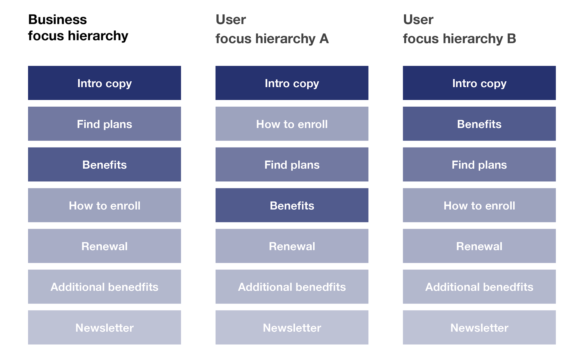
UX Insights > UX Requirements
The team turns those insights into actionable design goals.
Simplify the layout
The page has a lot of text and links; breaking content into clear sections with better visual hierarchy would make it easier to scan.
Improve readability
Increase line spacing and use bullet points for key information like eligibility, plan benefits, and how to enroll.
Highlight key actions
The “Find a plan” and “Enroll” buttons could be more prominent and consistently placed.
Add visual guidance
Use icons or infographics to help explain complex Medicaid terms or processes.
Enhance accessibility
Ensure color contrast meets WCAG standards and add descriptive alt text for all images.
Ideation & Strategy
Brainstorming
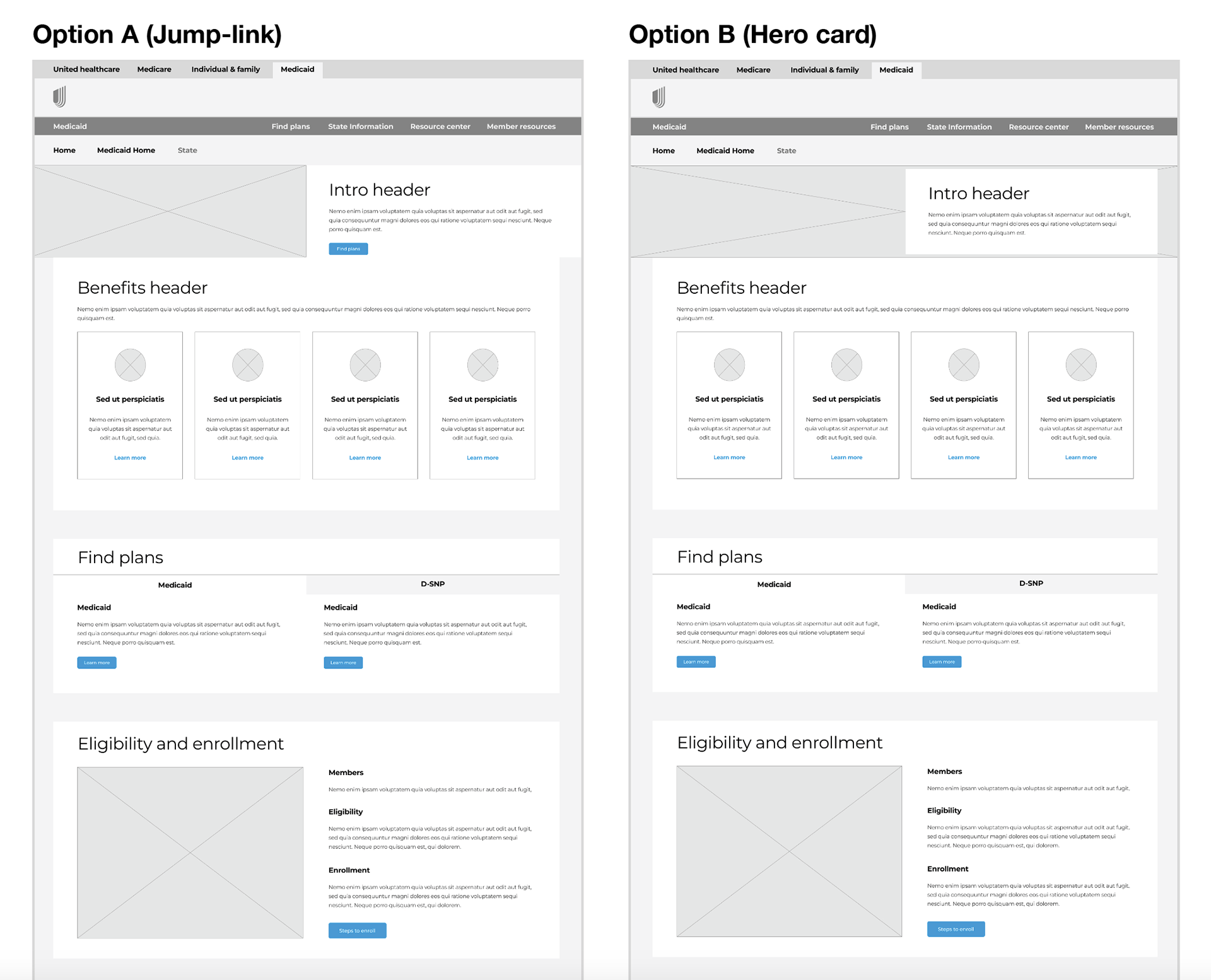
We started with team brainstorming sessions to find ways to make the Medicaid pages easier to use and more helpful. I sketched ideas, created wireframes, and used whiteboards to organize information clearly.
We simplified the page layout so users could easily find state-specific details, compare plans, and understand how to enroll. Key actions like “Find a Plan” and “Check Eligibility” were made more visible.
Design & Prototyping
First level of design
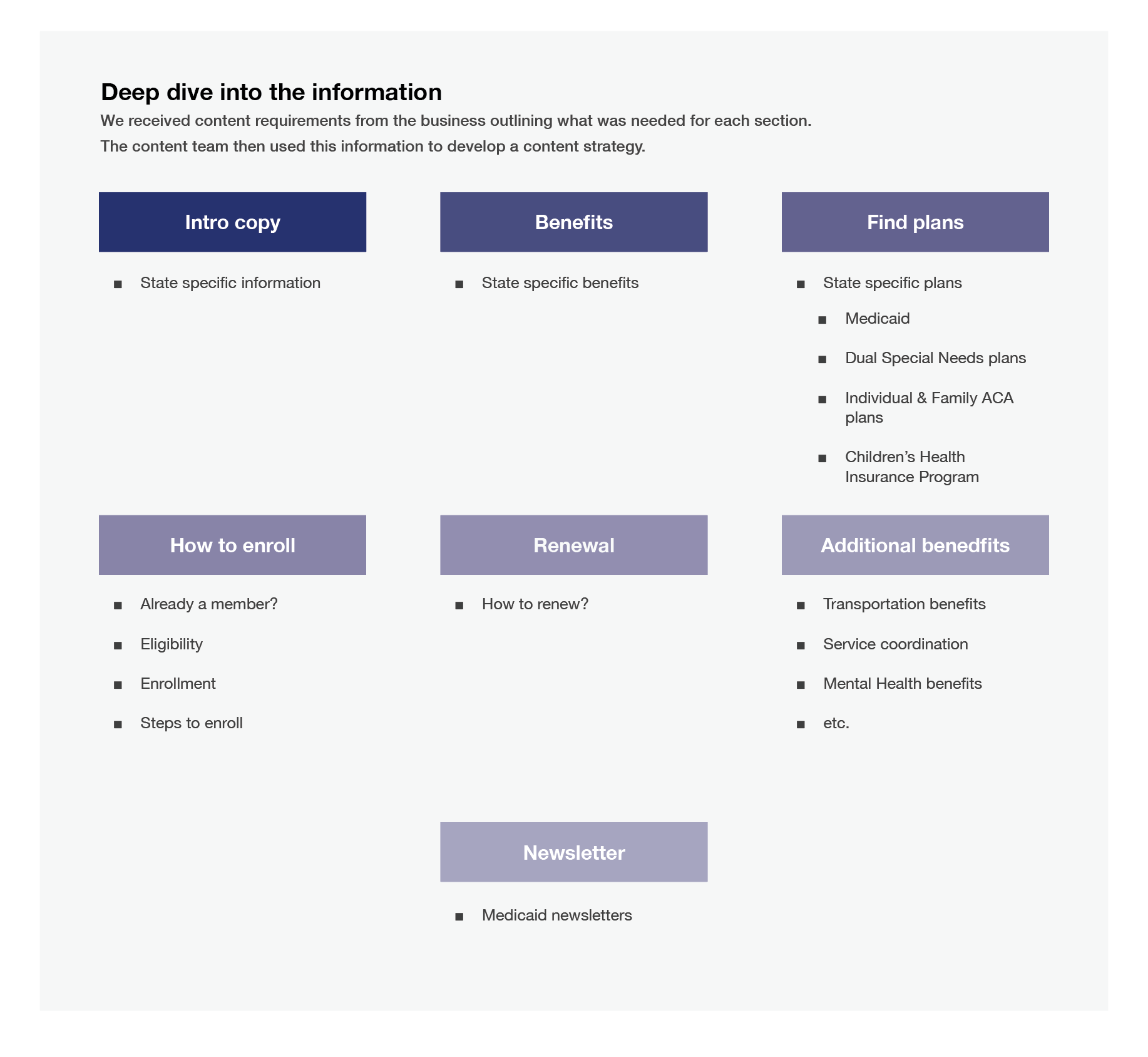
I translated the workshop findings into a clear information architecture and refined the wireframes through multiple rounds of revisions until achieving full alignment with the product team.
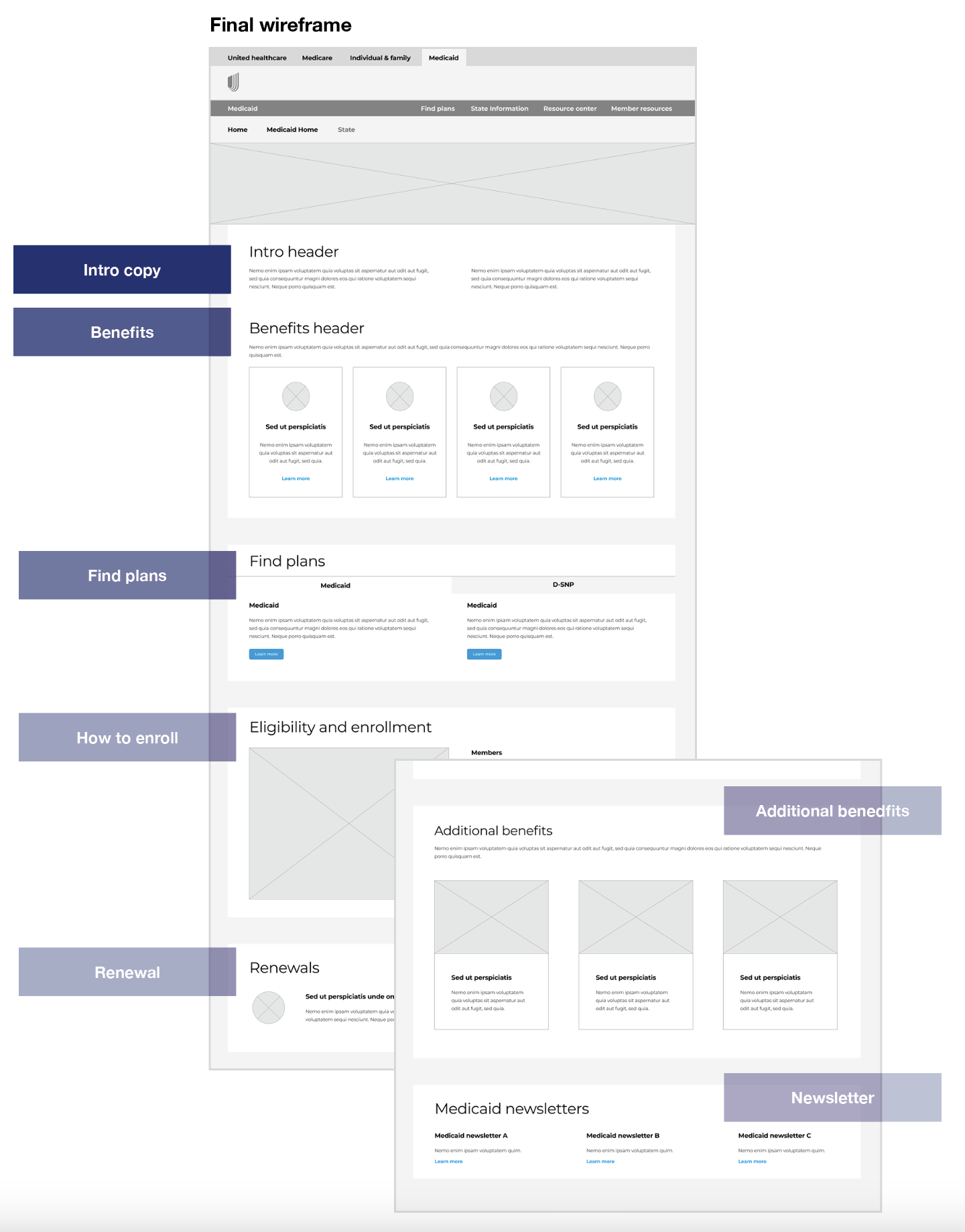
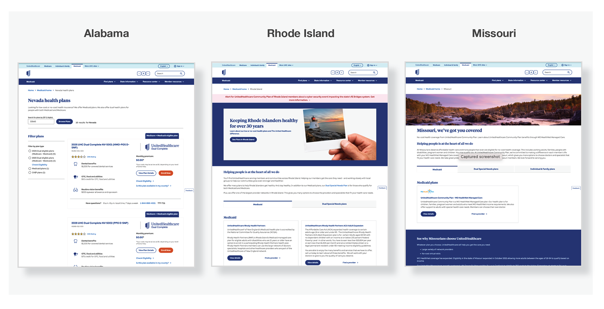
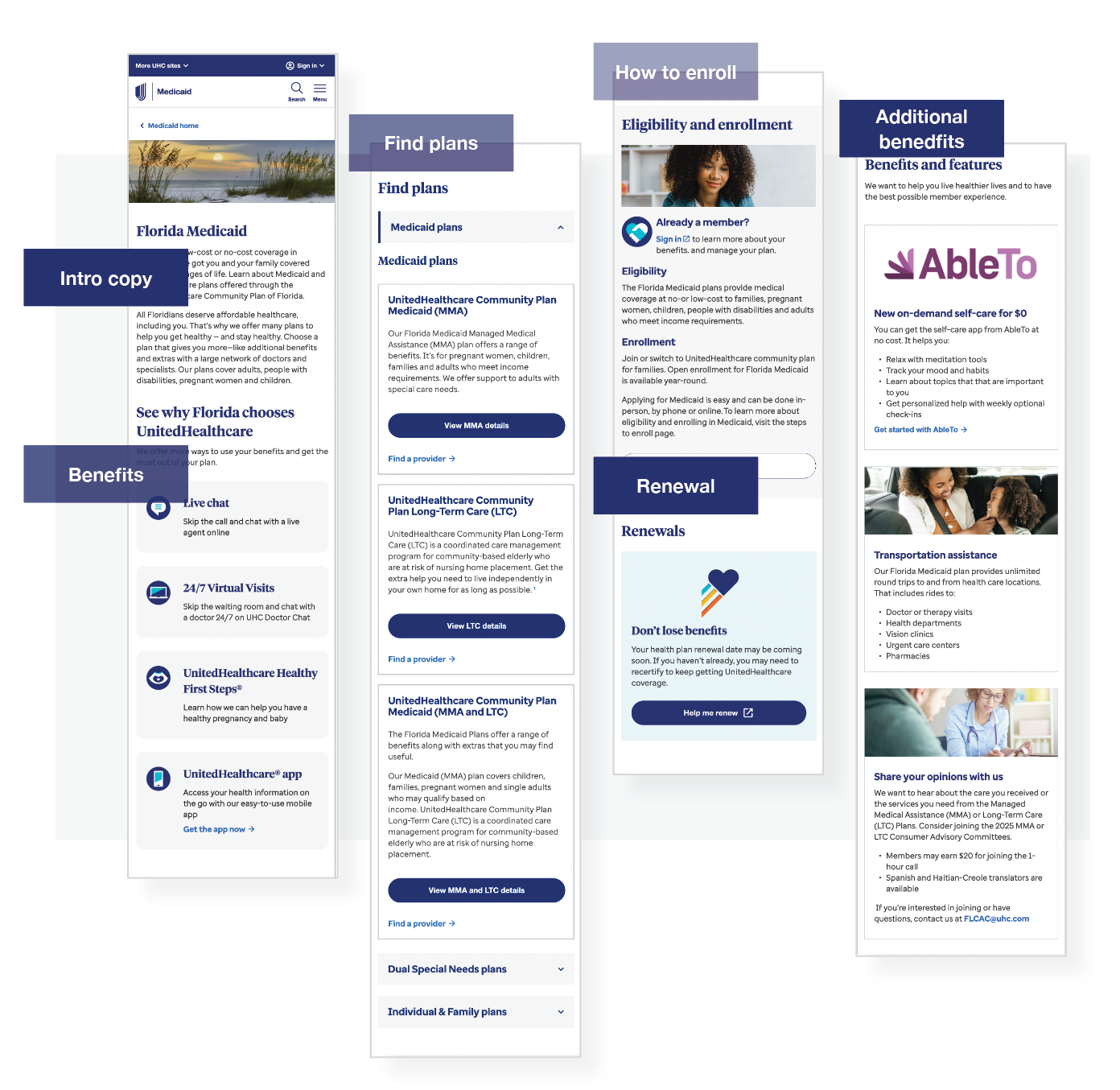
Design a design pattern library
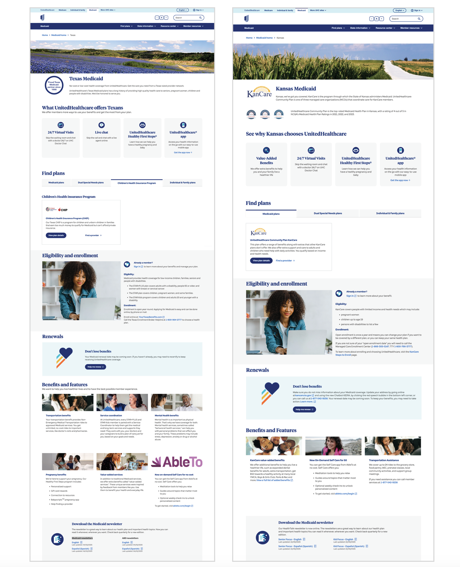
I designed a flexible system that could easily support all the content for 48 different markets.
I used the DPL as the building blocks to design each Medicaid state page.
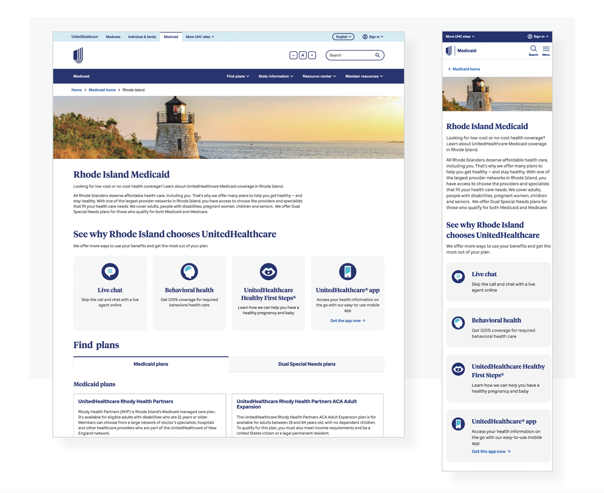
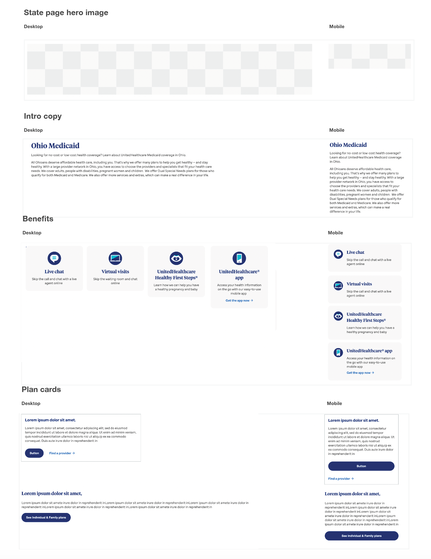
Each component is optimized for mobile.
Mobile experience before QA
Mobile-First Design Approach
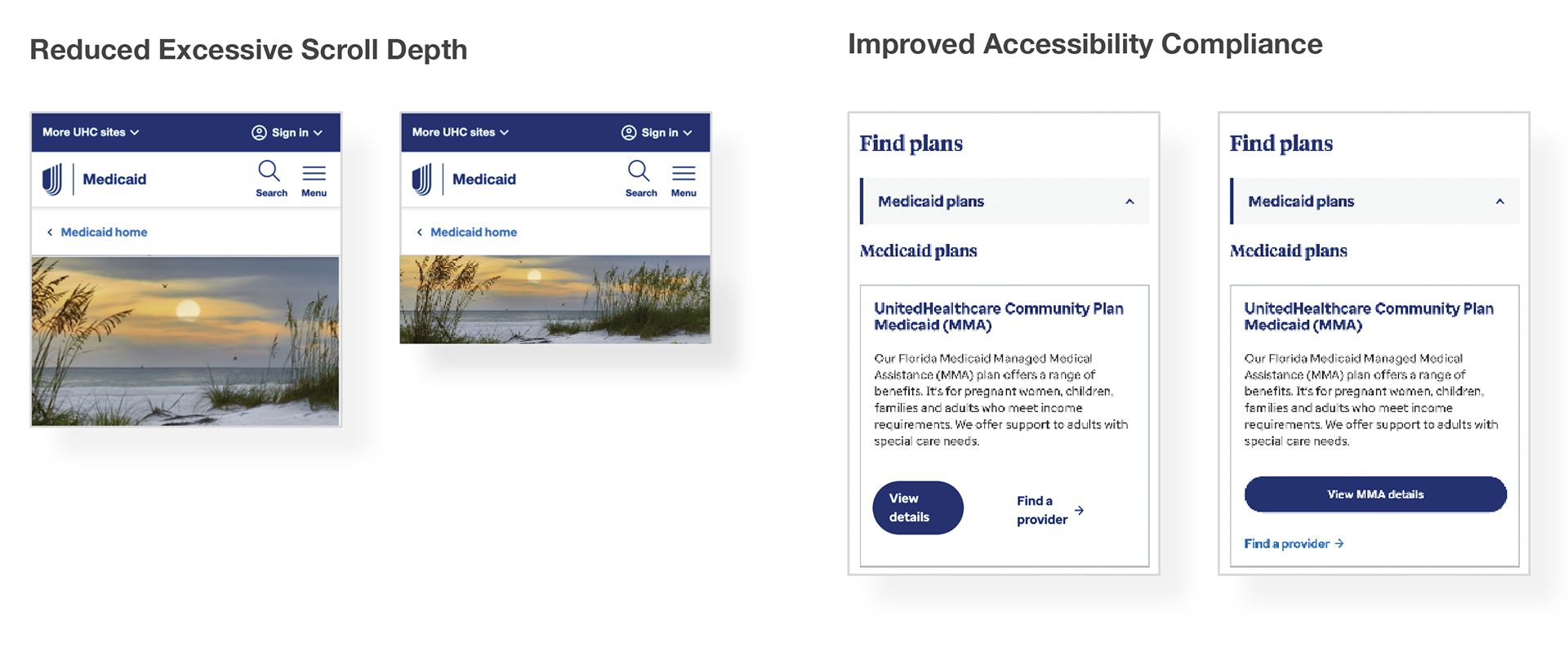
I optimized the design for mobile to improve accessibility and reduce excessive scrolling, making it easier for users to find what they need
Mobile Optimization Improvements for UHCCP Medicaid Plan State Pages
Reduced Excessive Scroll Depth
● Identified that the original mobile build introduced unnecessary vertical scrolling.
● Implemented a new optimized image height crop to significantly shorten scroll depth.
● Reorganized key content to ensure essential information appears sooner in the mobile viewport.
Improved Accessibility Compliance.
● Discovered key accessibility issues, including buttons that failed to meet required tap-target sizes.
● Partnered with AEM developers to correct and update component behavior across mobile layouts.
● Ensured all primary CTA buttons render at full-width on mobile to meet accessibility standards and enhance usability.
● Validated color contrast, spacing, and interactive states to align with WCAG/ADA requirements.
Enhanced Component Behavior for Mobile
● Collaborated closely with development to refine mobile-specific breakpoints and spacing.
● Verified that interactive components behaved consistently across devices and screen sizes.
● Ensured design intent was implemented as defined in UX specifications.
Testing & Validation
Type of testing:
Usability testing, cognitive walkthroughs.
Who We Tested With:
● Current Medicaid members who have used the site before.
● New users who are exploring Medicaid options for the first time.
● Caregivers or family members who help others enroll.
● Internal stakeholders (like customer service reps or state plan managers) for early feedback.
● This mix helped ensure we understood different perspectives — from first-time visitors to experienced users.
Qualitative Insights
● Qualitative Insights Users felt the new layout was cleaner and easier to follow.
● Participants liked that important actions (like “Check Eligibility” and “Find a Plan”) were easier to find.
● Users mentioned that the language was clearer and that they could understand the plan details faster.
Positive Findings (Quantitative Results)
Based on post-test surveys and task completion rates:
● 92% of participants said the new layout was easier to navigate.
● 85% found it easier to locate eligibility information compared to the old design.
● 90% successfully completed key tasks (like finding plan details) without help.
● 88% said the redesigned page looked more modern and trustworthy.