Project Overview
As a UX Designer for the John Deere GPT platform, I focused on solving two key challenges: enabling operators to manage multiple conversations simultaneously and allowing users to customize the chatbot’s tone and personality to match their preferences and workflow.
Explore the Prototype
Click Play to view the John Deere GPT prototype in action.
See how users can:
Manage multiple conversations at once.
Customize the chatbot tone for a more personal experience.
My Role
As the Lead UX Designer for the Autonomy Team, I embedded the UX process from concept to implementation — understanding user needs, advocating for their goals, and aligning them with business requirements. I created concepts and designs that shaped a new, intuitive user experience from the ground up.
Duration/timeframe: 4 Weeks
Goals:
Understand user needs for managing multiple conversations
Identify business requirements and constraints
Define how UX integrates with cross-functional teams
Deliver an end-to-end solution for the John Deere GPT experience
Team composition:
Designers, content specialists, researchers, developers, PMs, and stakeholders
Tools
Figma (Wireframes, mockups)
Figjam (workshops)
Miro: Collaboration
Adobe Creative Cloud (Presentations, optimization of photos and illustrations)
Microsoft Teams (conduct user interviews, workshops)

Problem Statement
Operators need an easier and faster way to set up their tractor operations. The current process is slow, requires too many steps, and makes it easy to make mistakes. Users also can’t manage more than one conversation or adjust the chatbot’s tone, which limits how they work.
We needed to create a smarter, more flexible GPT experience that reduces errors, supports multiple conversations, and adapts to each operator’s needs.
Research & Discovery
Key Collaboration Sessions:
UX Design Syncs:
Worked with other UX designers to ensure the GPT experience aligned with the broader John Deere design ecosystem and followed established patterns.
Product & PM Alignment:
Met regularly with product managers to confirm business requirements, validate priorities, and ensure the design supported project goals.
Content Collaboration:
Partnered with content strategists to refine language, tone, and prompts so the chatbot communication was clear, supportive, and user-focused.
Engineering Check-ins:
Reviewed feasibility and technical constraints with engineers to ensure smooth implementation from wireframes to final design
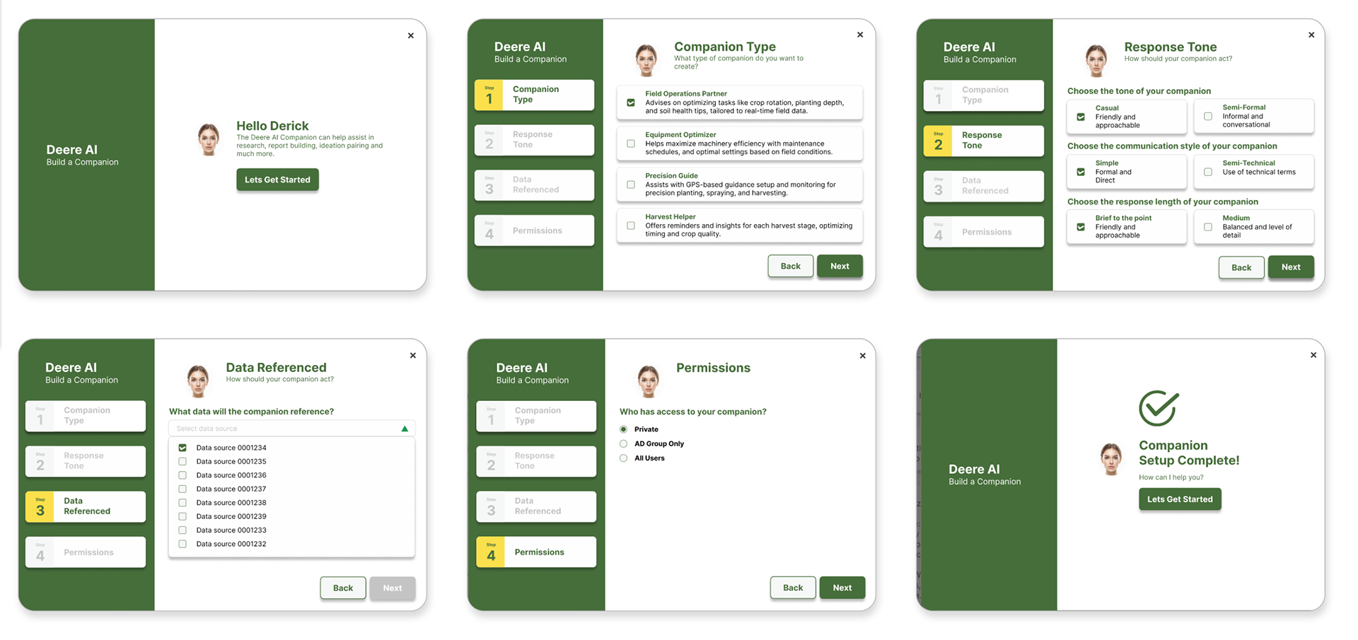
GPT Customization Flow Update Process
Analyzed Current GPT Customization Flow
Analyzed the existing GPT customization flow to understand what options were currently available for voice, tone, and behavior.
Reviewed Business Requirements for GPT Setup
Reviewed product requirements to identify what the business needed the GPT system to support for field display setup.
Researched User Needs for Customization
Researched user needs to learn what operators valued most when customizing their GPT assistant.
Synthesized Business + User Insights
Synthesized insights from business and user requirements to define what was essential vs. unnecessary.
Streamlined the Experience From 9 Screens to 6
Streamlined the experience by reducing the flow from nine screens down to six, making customization faster and more intuitive.
Current Flow
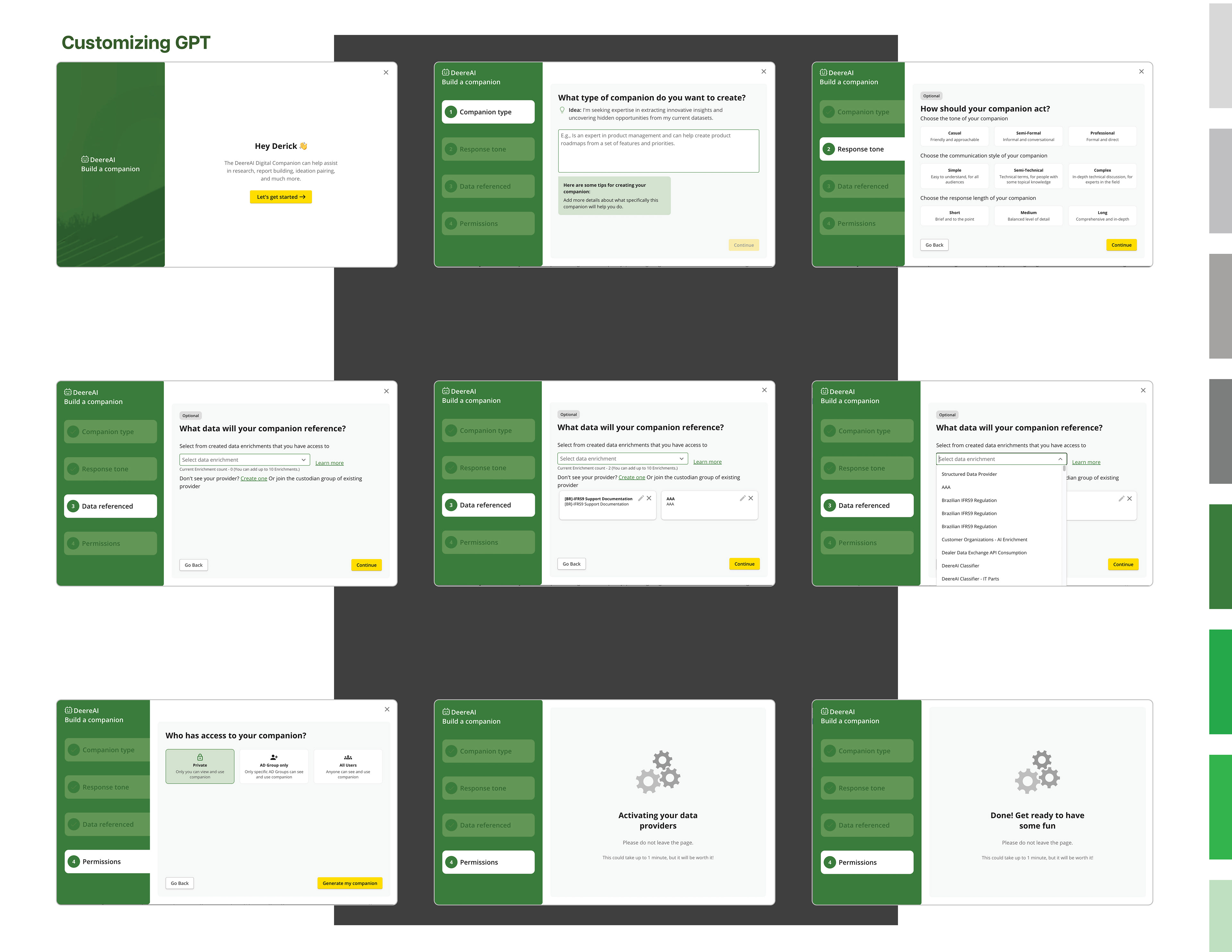
Updated Flow
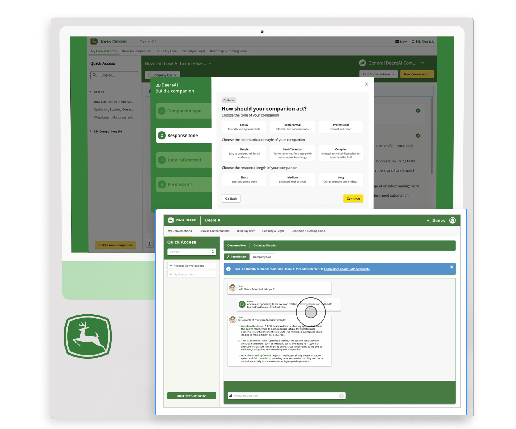
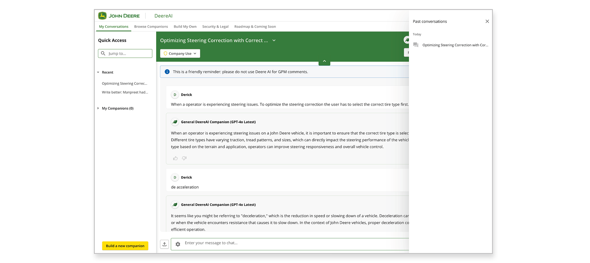
Improving the “View Previous Conversations” Experience
To redesign the conversation history feature, we analyzed several usability issues in the current flow:
Hidden Entry Point:
The "View Conversations" button was placed in the upper-right corner, making it difficult for users to notice or locate during active operation.
Low Discoverability:
Users reported that it took too long to find past conversations, slowing down their workflow.
Unintuitive Flyout Panel:
When the button was selected, a right-side flyout opened in a way that felt disconnected and visually unbalanced within the interface.
Interaction Friction:
The layout and hierarchy inside the flyout made scanning and selecting previous conversations harder than necessary.
The layout and hierarchy inside the flyout made scanning and selecting previous conversations harder than necessary.
"These insights informed the updates for a more intuitive, accessible, and efficient conversation history experience."
Usability Testing
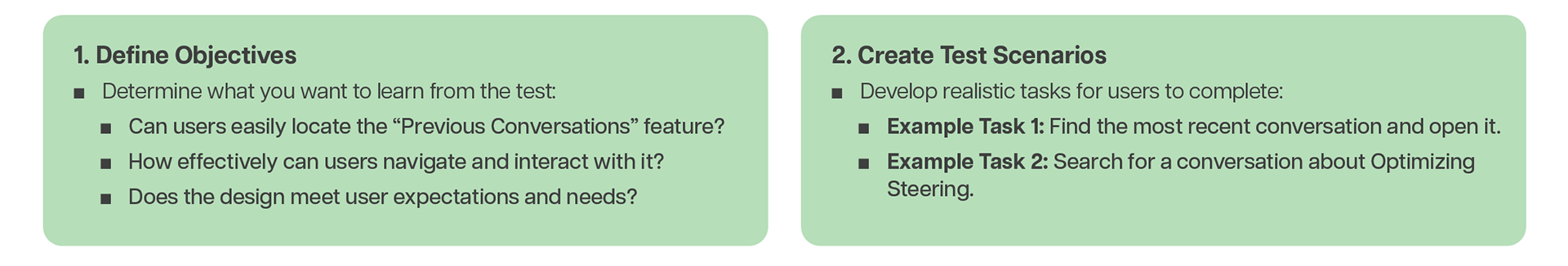

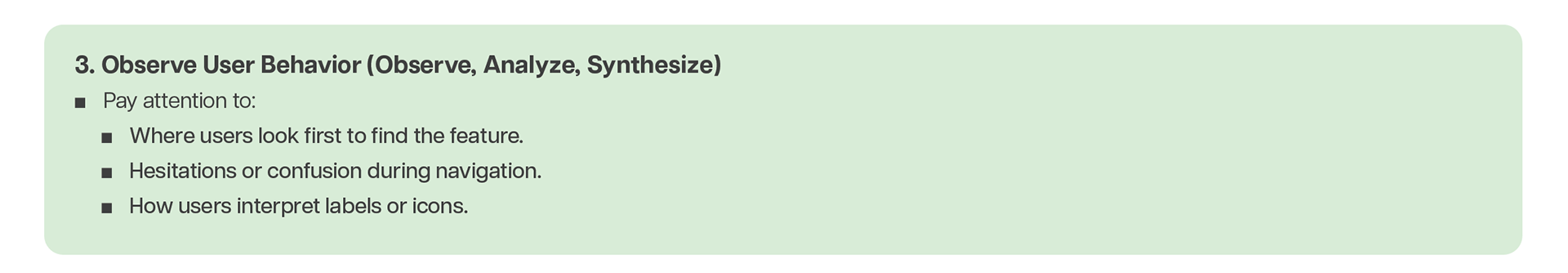
Design Direction Based on Feedback
Relocated the “Previous Conversations” feature to a more visible, high-priority area of the interface, making it easier for users to find, access, and navigate conversation history without breaking their workflow.
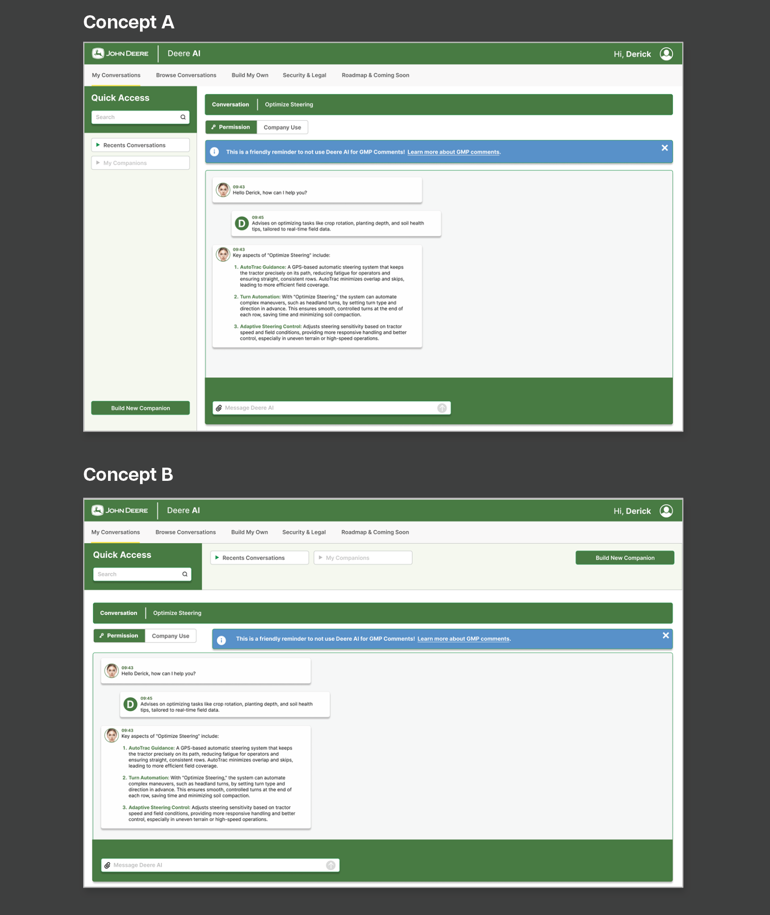
A/B Testing
Location Placement of “Previous Conversation”
User-centered reasons why participants preferred the left-panel concept during A/B testing:
Why Users Preferred the Left-Panel Placement
Consistent with common UI patterns
Users are familiar with left-hand navigation from other tools and applications, making it feel intuitive and easy to adopt.
Users are familiar with left-hand navigation from other tools and applications, making it feel intuitive and easy to adopt.
Always visible and easy to find
The left panel provides a persistent location for conversations, reducing the need to search or scan the page to locate recent threads.
The left panel provides a persistent location for conversations, reducing the need to search or scan the page to locate recent threads.
Improved workflow efficiency
Users can switch between conversations with fewer clicks and without scrolling, helping them stay focused during field operations.
Users can switch between conversations with fewer clicks and without scrolling, helping them stay focused during field operations.

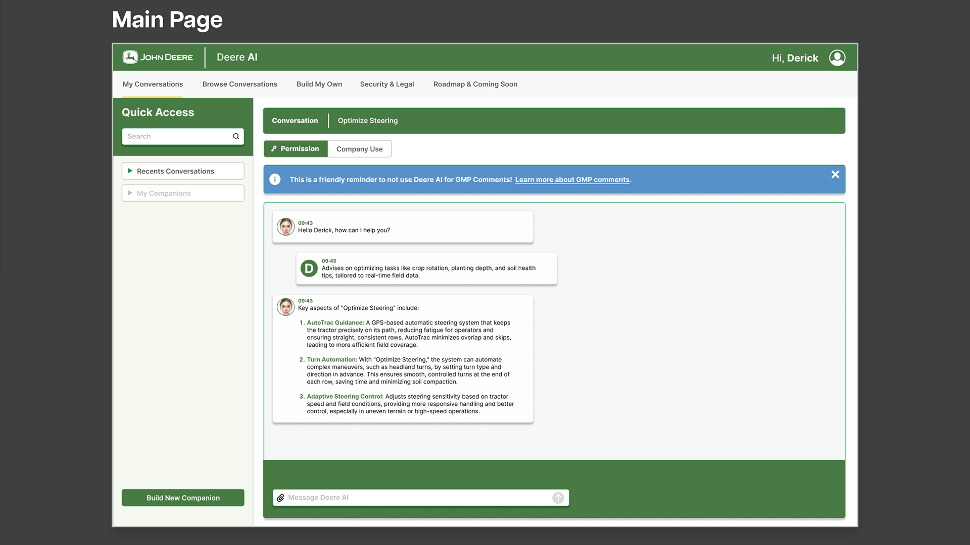
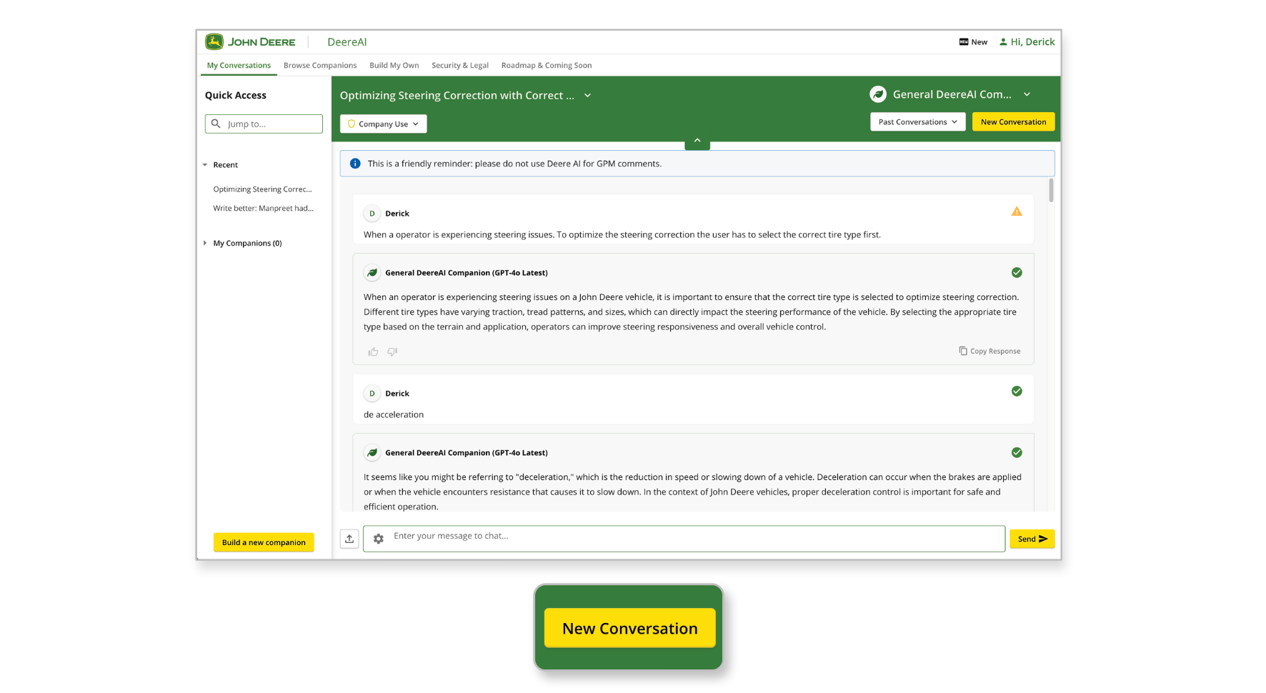
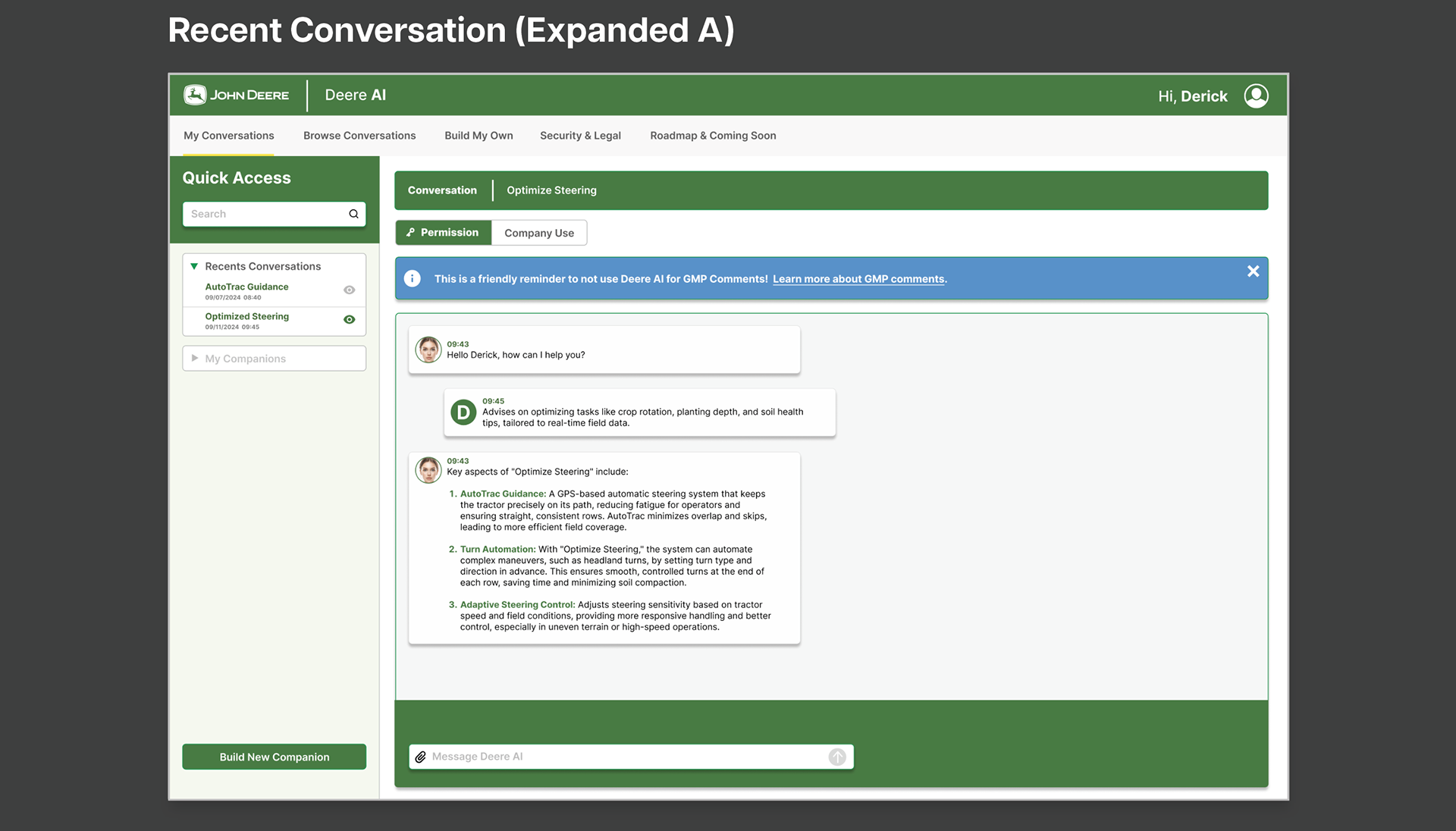
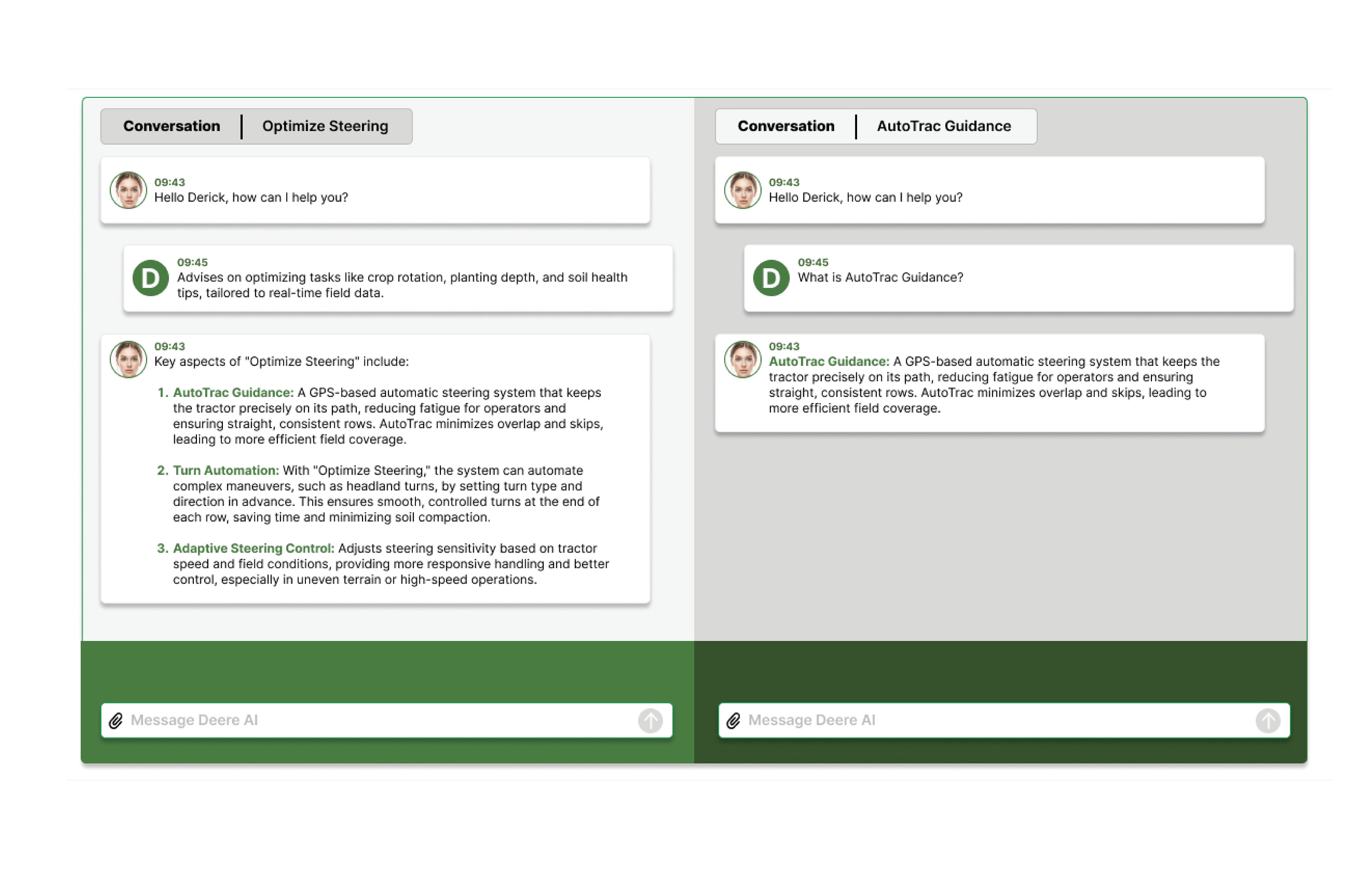
Conversation A
The main screen displays Conversation A as the active thread, allowing the user to clearly view and follow the full conversation for that selected session.
The main screen displays Conversation A as the active thread, allowing the user to clearly view and follow the full conversation for that selected session.
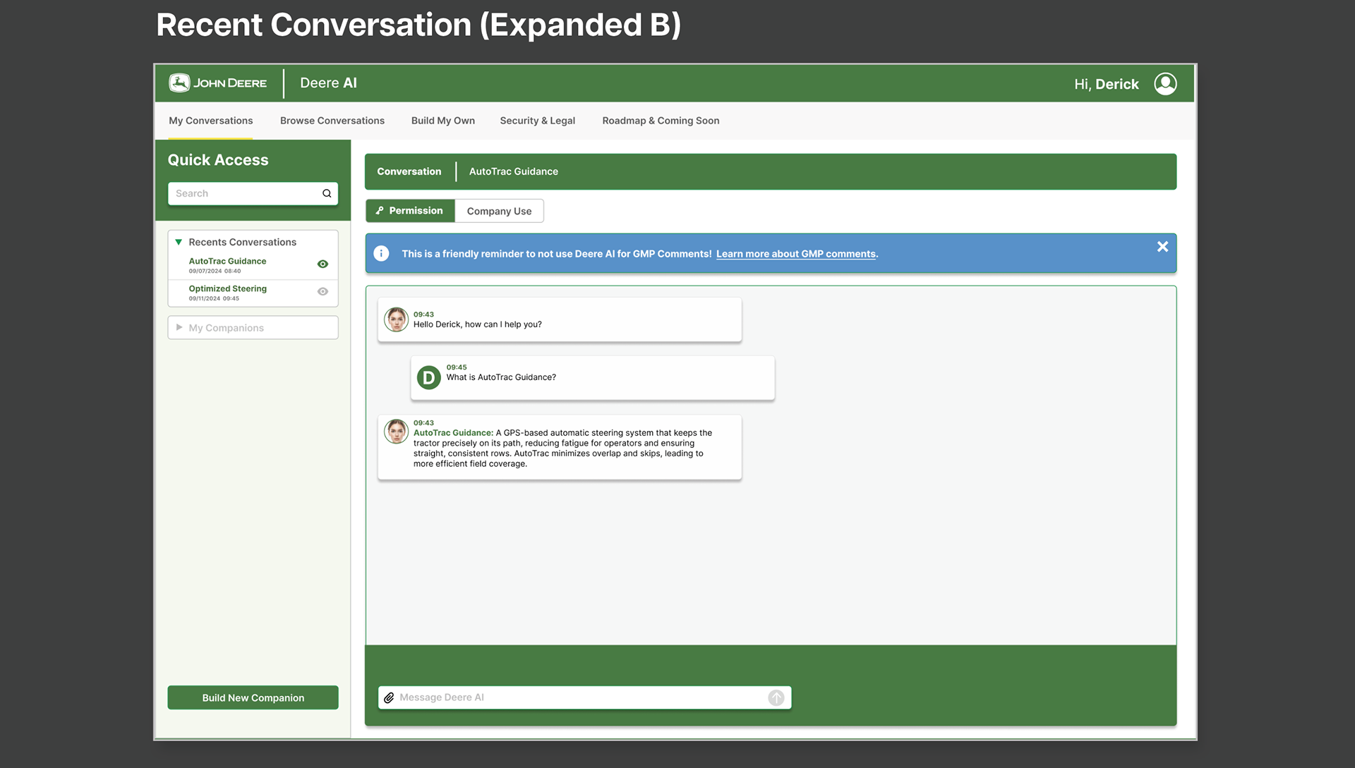
Conversation B Expanded
Conversation B is opened and displayed as the active thread, giving the user a clear view of the second conversation. From here, they can interact with the thread to complete field setup or manage field operations.
Conversation B is opened and displayed as the active thread, giving the user a clear view of the second conversation. From here, they can interact with the thread to complete field setup or manage field operations.
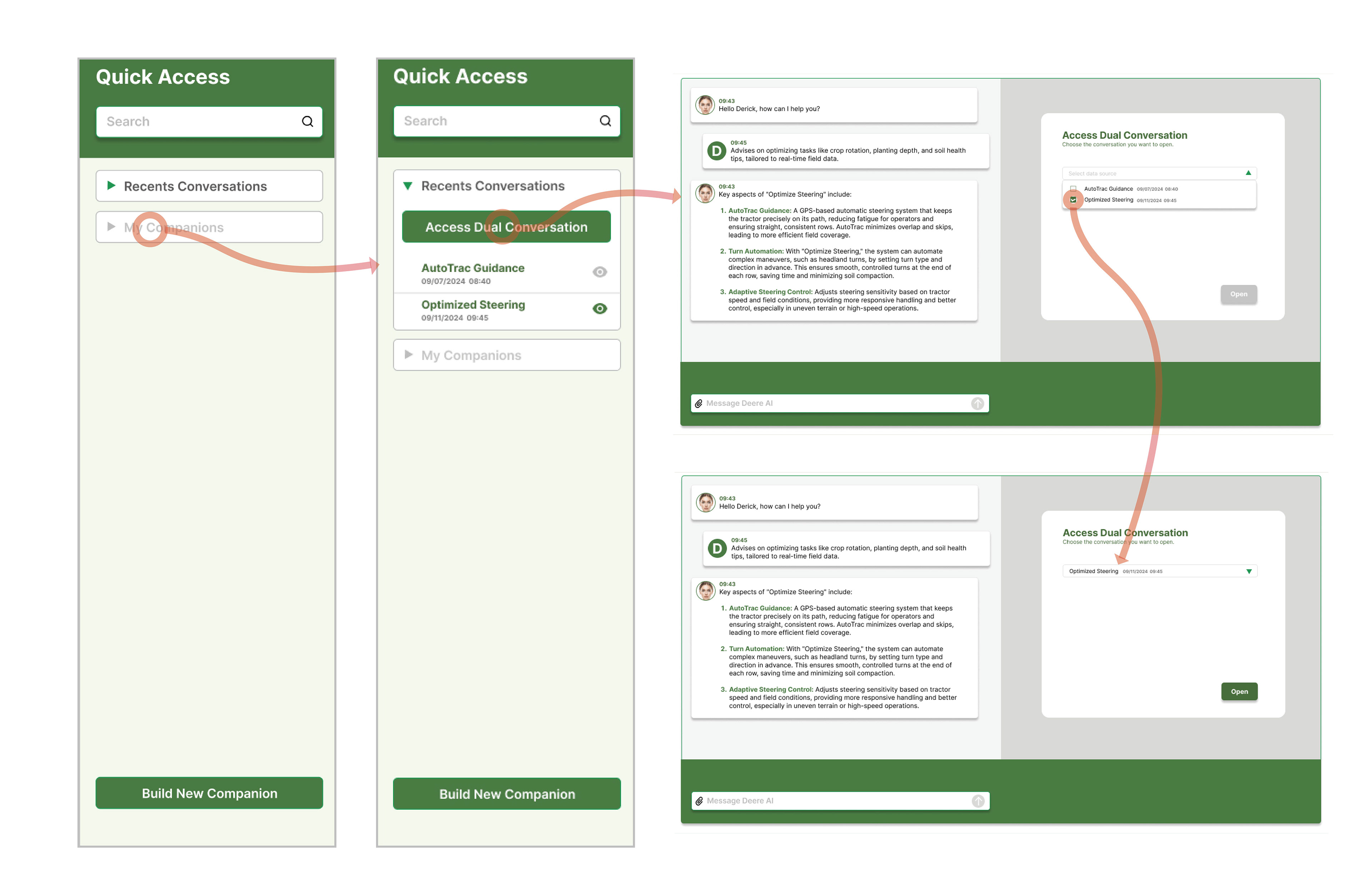
Updated Requirements: Multi-Conversation View for Field Setup
1. Dual-Conversation Display
The system shall allow users to view two GPT field-setup conversations simultaneously on the screen.
Both conversations must be visible side-by-side in a split-view layout without requiring the user to switch pages.
2. Independent Interaction
Each conversation panel must allow users to type, send messages, and scroll independently. User actions in one conversation must not affect the content or state of the other.
Why Users Preferred the Left Panel (70% Preference)
65% said it was easier to access
The left panel kept conversations visible at all times, reducing the need to search or scroll.
The left panel kept conversations visible at all times, reducing the need to search or scroll.
58% said it fit their existing mental model
Users were already familiar with left-side navigation from other software they use daily (email, messaging apps, farm management tools).
Users were already familiar with left-side navigation from other software they use daily (email, messaging apps, farm management tools).
54% said switching between conversations felt faster
The persistent list reduced cognitive load and allowed operators to quickly move between Conversation A and B.
The persistent list reduced cognitive load and allowed operators to quickly move between Conversation A and B.
49% said it helped them stay oriented
The left panel provided a stable anchor point, making it easier to understand which conversation was active.
The left panel provided a stable anchor point, making it easier to understand which conversation was active.
42% said the top-panel version felt “hidden” or easy to miss
Important info placed at the top was easily overlooked during task-heavy field operations.
Important info placed at the top was easily overlooked during task-heavy field operations.