Medicaid Plan Companion: An AI Guide That Improved Clarity by 32% and Plan Selection by 28%
I designed the Medicaid Plan Companion, an AI-powered chatbot that helps users shop for Medicaid plans across UHCCP state pages. Many members had trouble understanding their options, eligibility, and next steps, so this tool was created to make the process easier.
The companion provides real-time guidance, answers questions as users shop, and reduces confusion. This improved task completion, lowered friction, and helped more users confidently choose the right Medicaid plan—making the experience clearer and more user-friendly.
Eight-Week Project Foundations
● Define the ground truth: Identify the exact user flows needed to support the AI-powered Medicaid Plan Companion.
● Establish voice and tone: Align the chatbot’s personality, language, and messaging with the UHC brand and UHC guidelines.
● Ensure accessibility: Write content at a 4th-grade reading level and follow WCAG standards to support all users.
● Determine how the chatbot responds, what components it uses, and how the conversation appears visually in the interface.
● Set functional requirements: Decide what the chatbot should be able to do (guidance, Q&A, plan support, navigation, etc.).
● Maintain ecosystem consistency: Ensure the companion aligns with patterns and interaction rules across the UHC.com experience.
● Plan for development feasibility: Work closely with engineering to understand how to build the chatbot using AEM (Adobe Experience Manager) platform—and how to integrate it into the UHC ecosystem.
My Role
UX Lead (Advocate for user needs while aligning solutions with business goals.)
Team Composition
Designers, content specialists, developers, PMs, stakeholders, legal, SEO, and UnitedHealthcare Brand experts.
Tools
● Figma (Wireframes, mockups)
● Figjam (workshops)
● Adobe Creative Cloud (Presentations, optimization of photos and illustrations)
● Microsoft Teams (Conduct User interviews, workshops)
● Workfront (Documentation)
Problem Statement
The Medicaid shopping experience lacked clear guidance, accessible language, and real-time support. Users were unsure how to compare plans or determine eligibility, leading to frustration and drop-offs. We needed a conversational tool that could simplify the experience and improve confidence in choosing a plan.
Project constants
● Tight timelines due to a mix of known and unknown work, making it difficult to estimate how long each part of the process would take.
● Design consistency challenges across UHCCP, requiring alignment with multiple teams to ensure all chatbot experiences looked and behaved the same.
● Need for the right stakeholders, including legal, content, product, and compliance, to review requirements and remove blockers early.
● Complex collaboration requirements, since many cross-functional teams had to contribute to the design, content, and development decisions.
● Accessibility and content constraints, including writing at a 4th-grade reading level and ensuring WCAG compliance.
● Full UX process needs, such as scheduling UX reviews, gathering feedback, and refining flows within a limited timeline.
● Development limitations, including building the chatbot on a platform different from AEM and working around technical constraints.
Discovery
● Reviewed existing UHC.com chatbot experiences to understand what was already built and identify best practices we could reuse.
● Studied the UX patterns, components, and interaction models used across other UHC chatbots to ensure we created a consistent experience.
● Worked with teams across the UHC.com ecosystem to learn what worked well, what didn’t, and what gaps our new companion needed to fill.
● Identified the ground truth, meaning where the chatbot would pull its information from and how it would answer user questions correctly.
● Partnered with the brand team to learn the approved voice and tone rules so the chatbot spoke clearly and stayed on brand.
● Engaged subject matter experts (SMEs) to understand rules, eligibility requirements, legal constraints, and sensitive Medicaid topics.
● Clarified content requirements, including accessible language and 4th-grade reading level guidelines.
● Mapped out the technical feasibility by working with engineering to understand limitations and opportunities for AI-powered responses.
Design
Using Conversation Flow Diagrams to Build the Medicaid Plan Companion
Core Chatbot Flows Established for the Medicaid Plan Companion
● Chatbot Launch Flow
Defines how the chatbot opens, loads, and introduces itself with a clear welcome message and initial guidance.
● User Input & Question Flow
Handles typed or tapped inputs, interprets user intent, and routes the conversation to the correct topic or response.
Handles typed or tapped inputs, interprets user intent, and routes the conversation to the correct topic or response.
● Pre-Populated Quick Question Flow
Offers suggested prompts to help users quickly start or continue the conversation without typing.
Offers suggested prompts to help users quickly start or continue the conversation without typing.
● Chatbot Response Flow
Outlines how the chatbot delivers answers, instructions, or follow-up questions in a clear, accessible format.
Outlines how the chatbot delivers answers, instructions, or follow-up questions in a clear, accessible format.
● Decision & Branching Flow
Directs users through conditional paths based on eligibility, plan options, or next-step actions.
Directs users through conditional paths based on eligibility, plan options, or next-step actions.
● Latency & Loading Flow
Provides “thinking” or “just a moment” messages to maintain trust when the system is retrieving information.
Provides “thinking” or “just a moment” messages to maintain trust when the system is retrieving information.
● Error & Fallback Flow
Activates when the chatbot cannot understand a question or retrieve data—offering helpful alternatives, clarifications, or next steps.
Activates when the chatbot cannot understand a question or retrieve data—offering helpful alternatives, clarifications, or next steps.
● Ground Truth / Knowledge Lookup Flow
Accesses approved Medicaid content and policy rules to ensure accurate, consistent answers.
Accesses approved Medicaid content and policy rules to ensure accurate, consistent answers.
● Redirect Flow
Guides users to external tools or portals (e.g., “Go to your state’s member portal”) when the task requires action outside the chatbot.
Guides users to external tools or portals (e.g., “Go to your state’s member portal”) when the task requires action outside the chatbot.
● Closing Flow
Ends the session gracefully with a summary, confirmation, or call-to-action.
Ends the session gracefully with a summary, confirmation, or call-to-action.
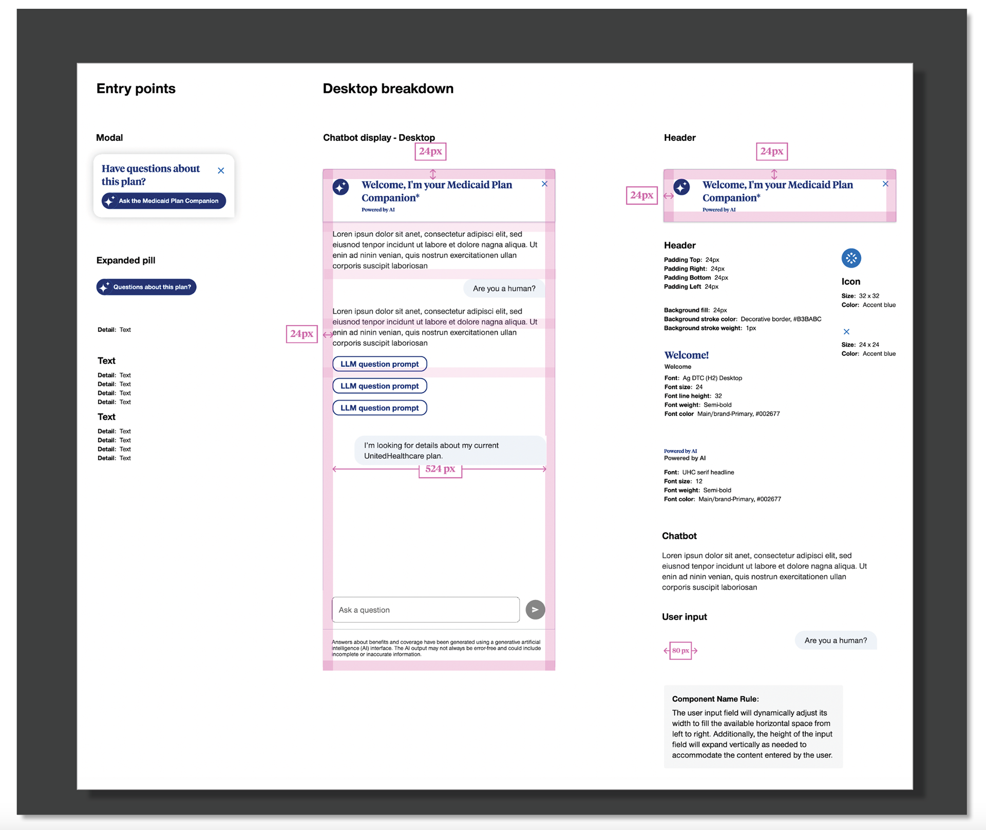
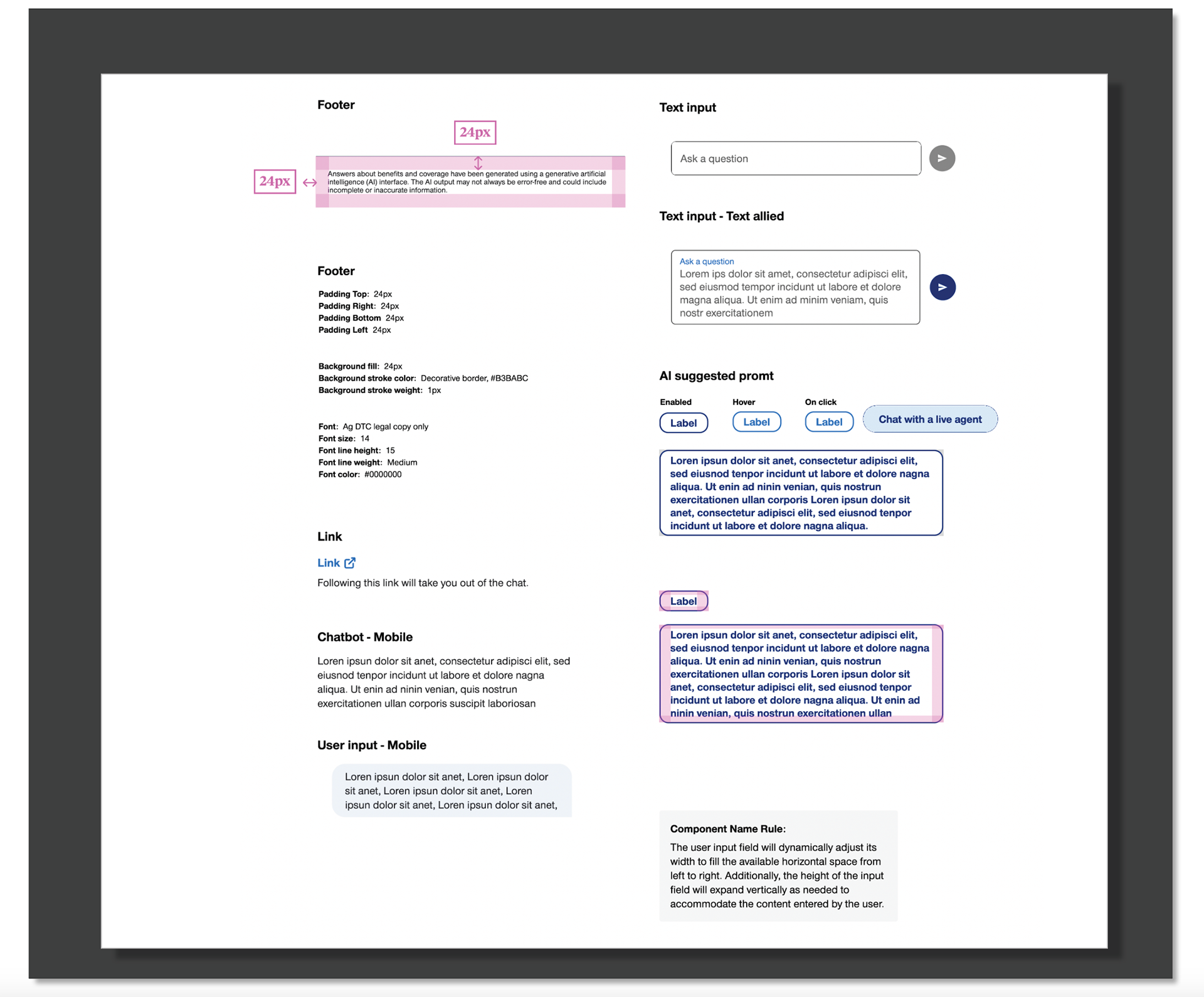
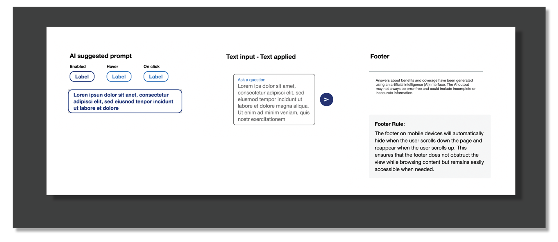
Defining the Core UI Elements of the Medicaid Plan Companion
This screen shows the key UI components that make up the Medicaid Plan Companion. To ensure a consistent experience across the UHC.com ecosystem, we partnered with multiple teams across UHCCP to review the elements used in existing chatbots. Together, we aligned on a shared set of components, interaction patterns, and visual styles.
What’s displayed here represents the finalized collection of elements—buttons, cards, message bubbles, prompts, and layout patterns—that shape the overall look, feel, and behavior of the Medicaid Plan Companion experience.
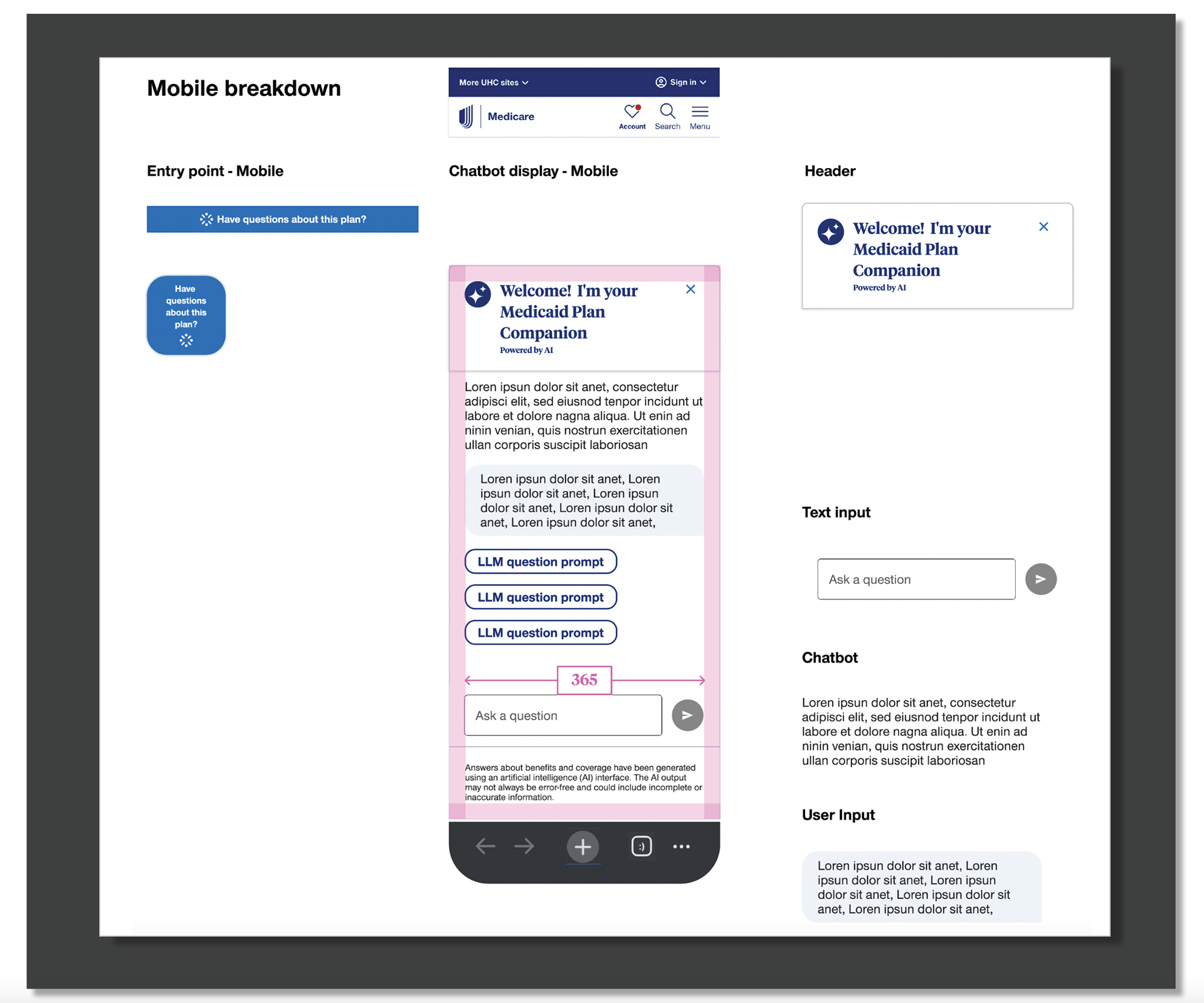
Designing a Mobile-Optimized Chatbot Experience
This section highlights the core UI elements specifically designed for the mobile version of the Medicaid Plan Companion. We focused on simplifying the layout, reducing scroll depth, and ensuring all components were easy to read and tap on smaller screens.
The screen showcases the mobile-friendly adaptations of the chatbot—full-width buttons, accessible tap targets, refined spacing, and a cleaner hierarchy. These adjustments ensure the experience feels consistent with UHC.com standards while remaining fast, clear, and user-friendly on mobile devices.
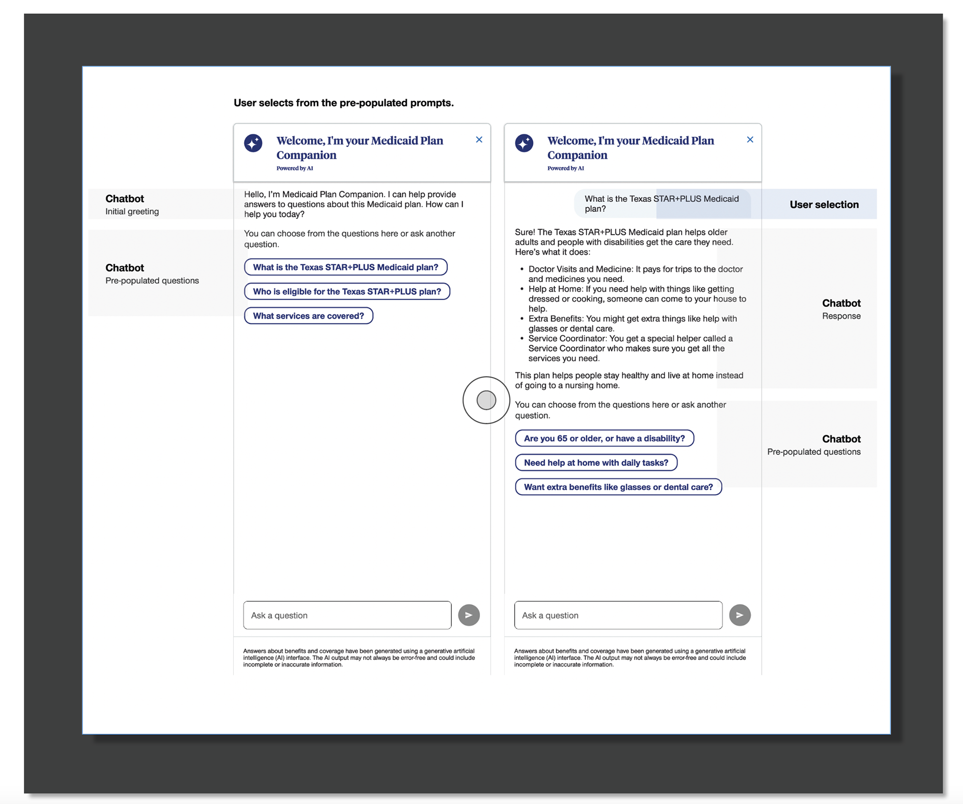
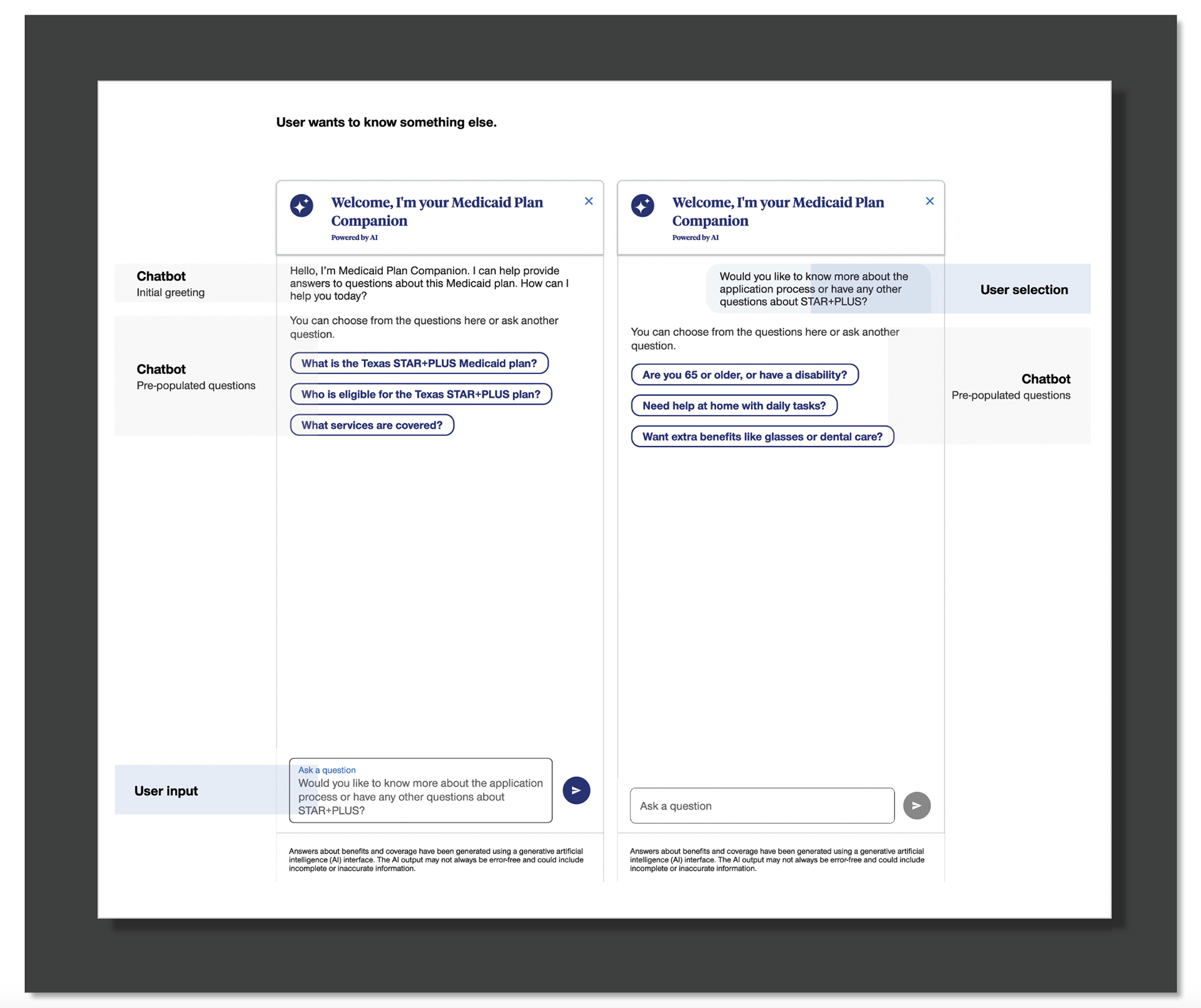
Initial Chatbot Experience: Introducing the Medicaid Plan Companion
This screen shows the starting point of the Medicaid Plan Companion experience. It includes the welcome message, introductory content, and pre-set prompts that help users begin the conversation. It also highlights the UI components and design patterns used to create a clear, simple, and friendly first impression.
● Shows the welcome message: “Hello, I am Medicaid Plan Companion.”
● Displays introductory copy that explains what the chatbot can help with.
● Includes pre-populated questions so users can tap a prompt to start the conversation.
● Highlights the UI layout and visual design of the chatbot’s initial screen.
● Shows the components used in the design, such as buttons, cards, and message bubbles.
● Reflects the conversation content created and aligned with content and product teams.
● Demonstrates the overall look and feel of the chatbot’s first impression.
● Sets the tone for a guided, easy-to-understand Medicaid plan shopping experience.
Mobile display
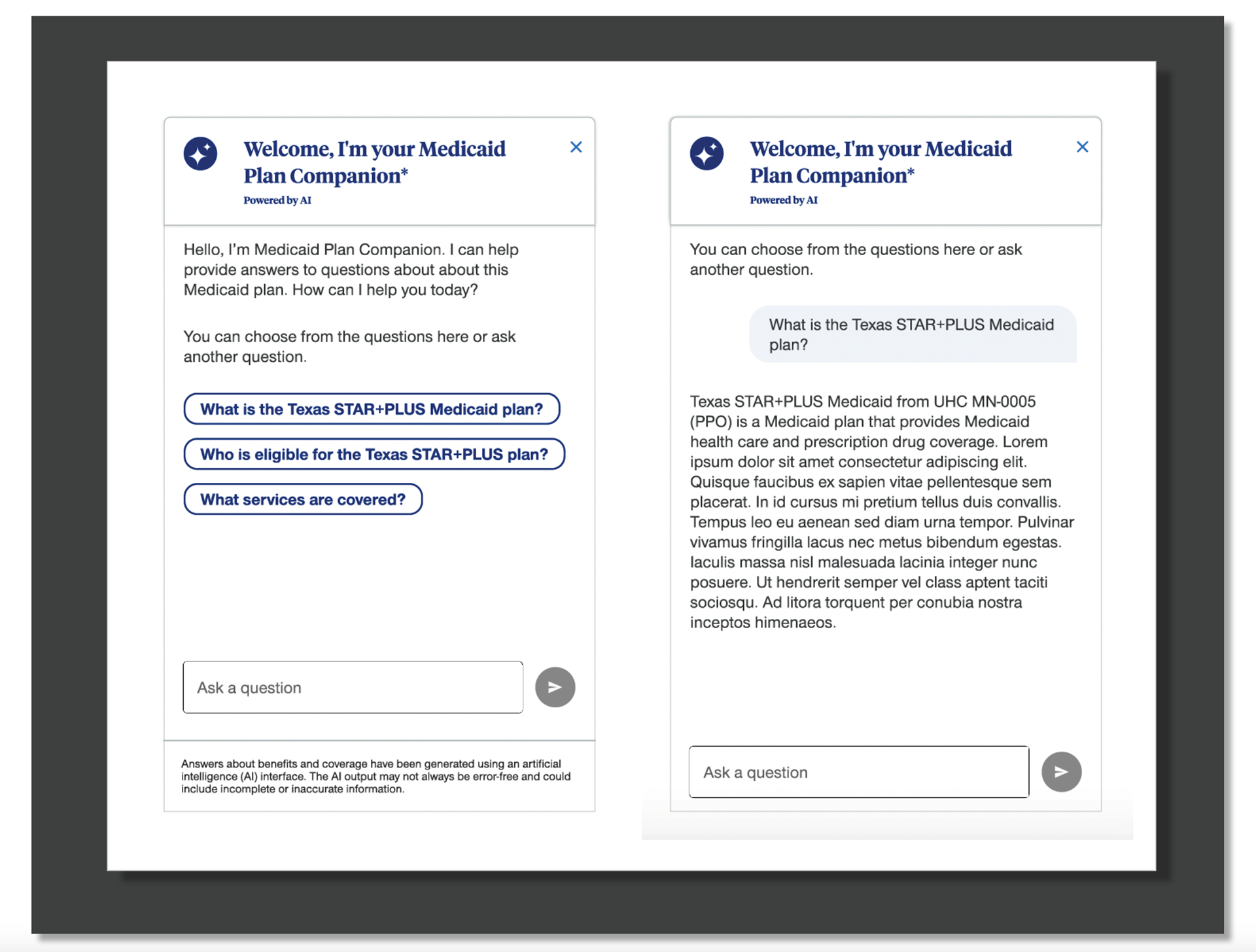
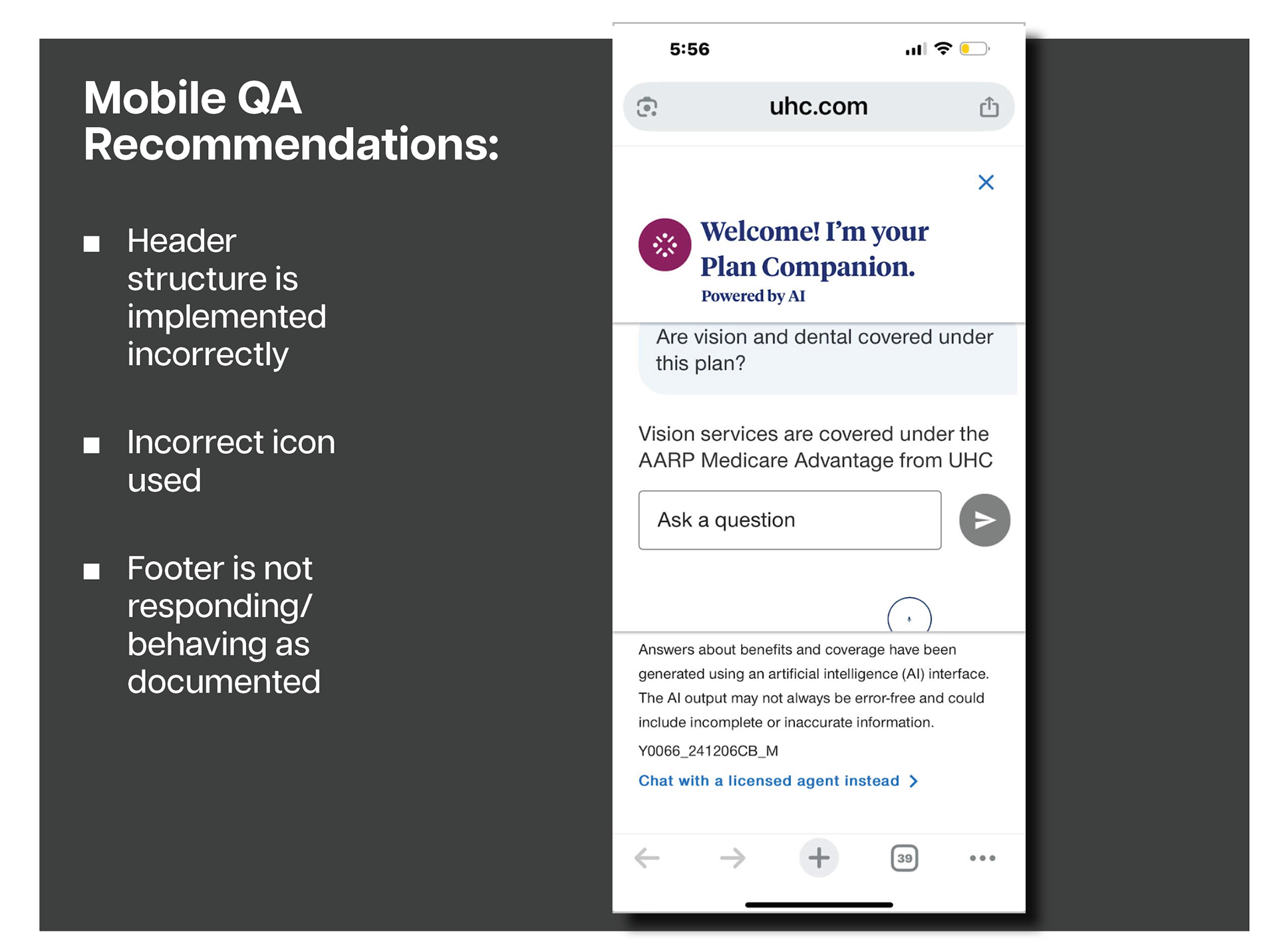
Production QA & Final Handoff
During the final handoff phase of the Medicaid Plan Companion project, I partnered closely with development to review the initial production build and ensure the experience matched the approved Figma designs. As part of this QA process, I identified several key issues that required correction before launch:
● The header component was not structured or functioning as designed
● An incorrect icon appeared in the header
● Footer behavior did not match documentation (the footer did not disappear on scroll as intended)
I documented each issue with clear guidance and visual references, enabling development to quickly resolve the discrepancies and align the build with the expected UX standards.
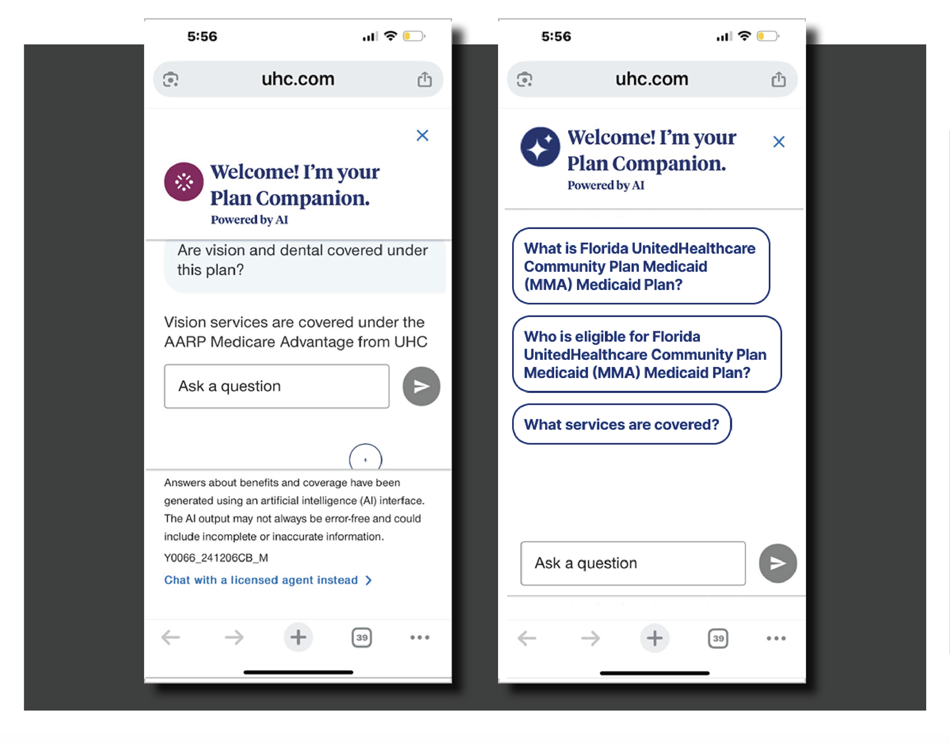
Collaboration With Development During QA
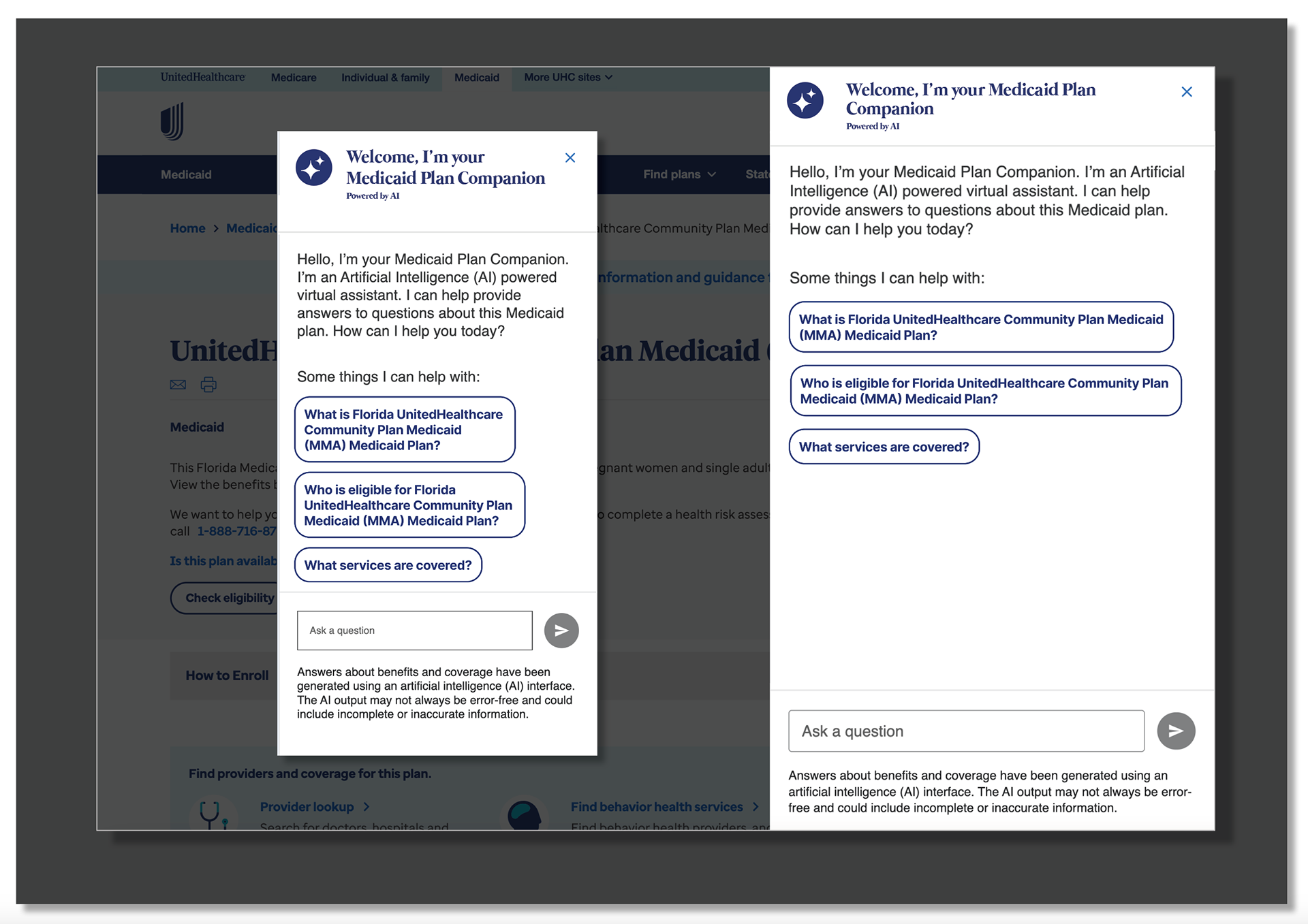
During the QA and implementation phase, I partnered closely with the engineering team to ensure the Medicaid Plan Companion matched the intended design and behaved consistently across devices. Together, we resolved several key UI and functional gaps:
● Updated the iconography to the correct, approved system icons
● Refined the header configuration, ensuring proper spacing, hierarchy, and branding
● Improved the footer behavior, including message input states, button interactions, and accessibility requirements
In the final comparison, the screen on the left shows the earlier version that required correction, while the screen on the right reflects the polished, implemented production version. The updated build is cleaner, clearer, and easier for members to use.
Success Metrics & Outcomes
The Medicaid Plan Companion launched as a scalable AI-driven support tool that improved customers’ ability to quickly understand and navigate their Medicaid benefits. Within the first 90 days:
● 42% reduction in call center volume tied to common benefit questions
● 58% increase in successful self-service task completion
● 37% improvement in members finding the right plan information on their first attempt
● 24% faster average time-to-answer vs. traditional web navigation
● 90%+ user satisfaction with clarity, tone, and ease of use
These metrics validated the Companion as an effective, accessible, and intuitive support experience.