Simplifying Claims Workflows
Project Overview
Optum Provider Portal Pro — Centralized Claims Experience
The goal of this project was to streamline the fragmented claims management process into one centralized, easy-to-use hub for medical professionals. Previously, providers had to switch between three different applications to manage care and process claims — leading to frequent errors, incomplete tasks, and user frustration.
As a result, providers experienced a 30% increase in engagement with claims management tools and a 25% reduction in time spent completing core claim-related tasks.
"View the Prototype"
Click the play button below to explore the interactive prototype of the Claims Process — thoughtfully designed by myself and the Optum product team to simplify workflows, reduce errors, and create a seamless experience for medical professionals.

My Role
My role consists of embedding the UX Process from ideation to product implementation.
Duration/timeframe: 8 Weeks
Over 8 weeks, we found ways to improve the user experience and created a UX strategy and system that brought all user flows together in one place, helping medical professionals streamline and manage the claims process more efficiently.
Team composition:
Designers, content specialists, developers, PMs, stakeholders, legal, SEO, and UnitedHealthcare Brand experts.
Tools:
● Figma (Wireframes, mockups)
● Figjam (workshops)
● Miro: Collaboration
● Adobe Creative Cloud (Presentations, optimization of photos and illustrations)
● Microsoft Teams (Conduct User interviews, workshops)

Problem Statement
Medical professionals must use multiple applications to manage patient care, leading to time-consuming workflows and increased risk of errors when switching between systems. The process lacks consistency and accessibility, creating frustration and inefficiency. How might we design an integrated, error-proof, and accessible experience that streamlines care management for medical professionals?
Project key constraints:
Tight Timelines:
We had limited time to design and deliver key features, which meant focusing on the most important user and business needs first.
We had limited time to design and deliver key features, which meant focusing on the most important user and business needs first.
Collaboration Challenges:
It was difficult to know which teams to work with for content, legal, brand, and development. We often had to track down the right people to move things forward.
It was difficult to know which teams to work with for content, legal, brand, and development. We often had to track down the right people to move things forward.
Unclear Roles:
Ownership across teams wasn’t defined, making it hard to know who was responsible for certain parts of the project.
Ownership across teams wasn’t defined, making it hard to know who was responsible for certain parts of the project.
No Set UX Process:
There wasn’t an established process for how UX fit into the project, so we had to build one to keep design, research, and development aligned.
There wasn’t an established process for how UX fit into the project, so we had to build one to keep design, research, and development aligned.
Research & Discovery
To better understand user pain points and workflow challenges:
Conducted stakeholder interviews to align on business goals and uncover that medical professionals spent significant time switching between multiple applications to complete their daily tasks.
Conducted usability testing with office staff to observe real-world behaviors and understand the specific challenges they faced while completing tasks across different systems.
These insights highlighted key inefficiencies and usability gaps, guiding our approach to design a unified, streamlined provider portal experience.
Key Findings:
● Frequent context switching between systems led to lost time and increased cognitive load.
● High error rates occurred when data had to be re-entered across multiple tools.
● Users lacked a centralized location to access patient information, submit authorizations, and track care updates.
● The fragmented experience resulted in lower task efficiency and frustration, impacting both productivity and patient care quality.
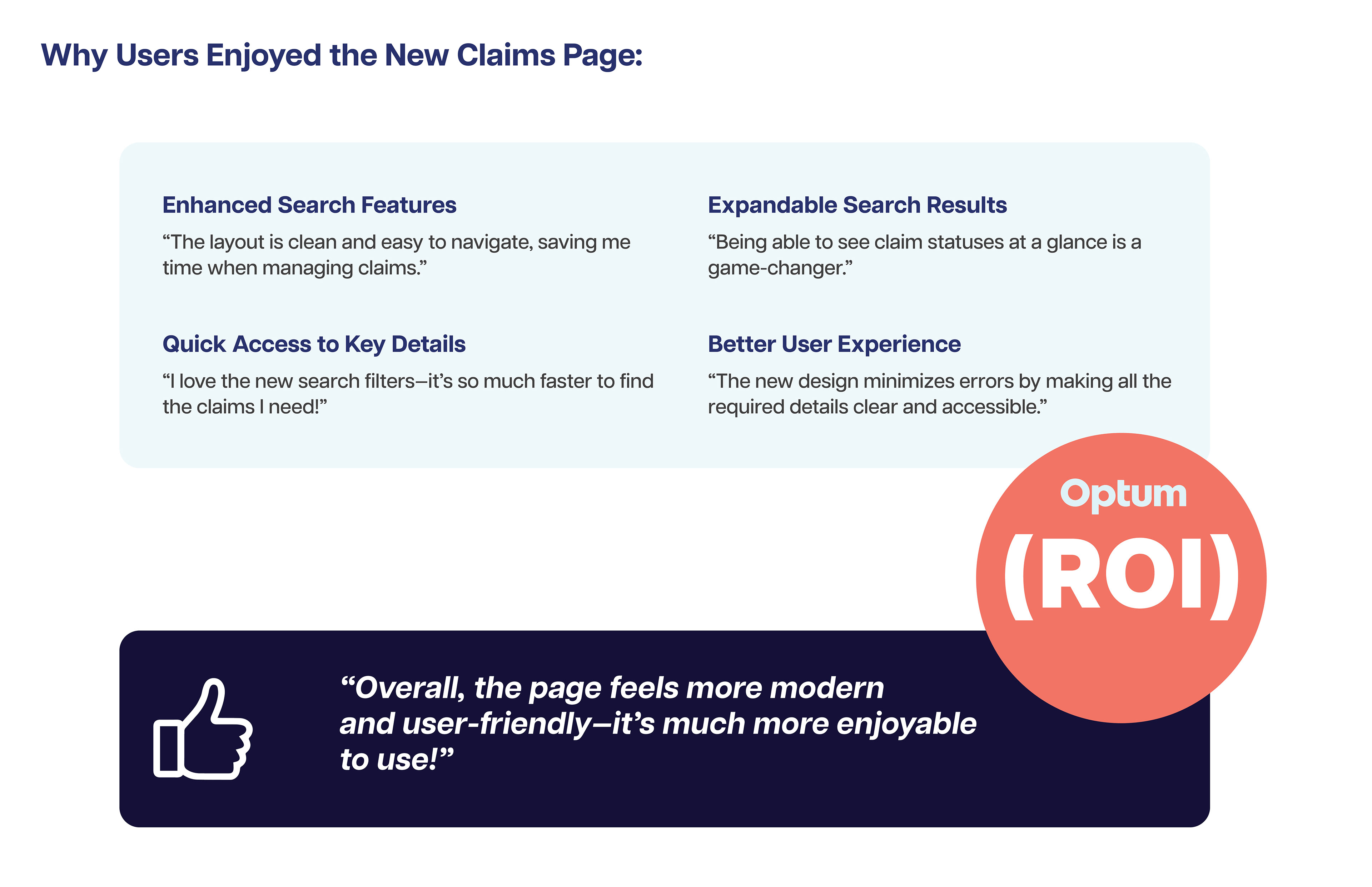
"These insights shaped our design direction — focusing on creating a unified, intuitive provider portal that reduces errors, improves efficiency, and supports a consistent, accessible workflow for medical professionals."
Ideation & Design
Business Requirements:
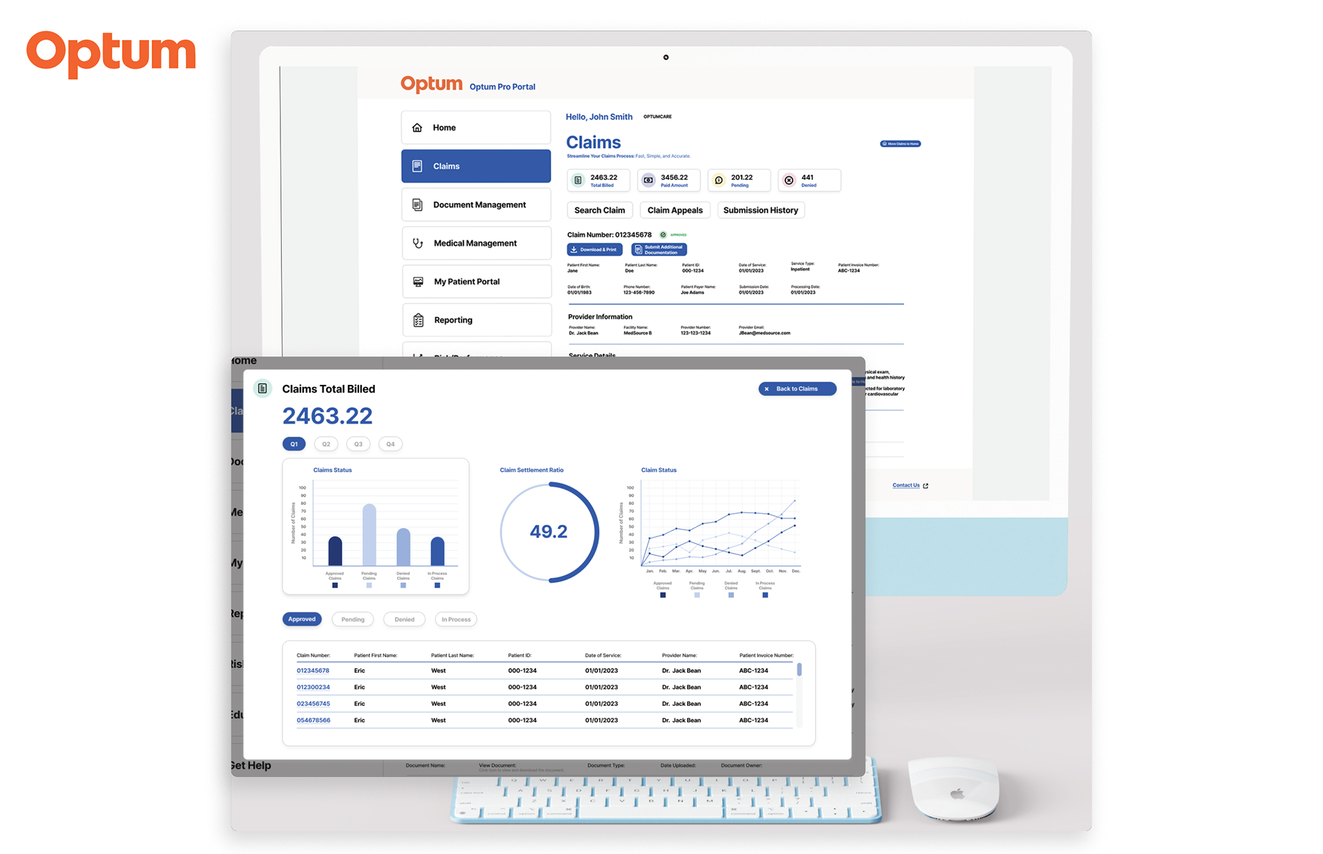
Dashboard Overview
Display key metrics: total claims, pending claims, approved claims, and denied claims.
Include a visual representation (e.g., bar chart or pie chart) of claim statuses for quick insights.
Claims Search
Provide search fields for Claim Number, Patient Name, Date of Service, Provider Name, and Claim Status.
Claims List
Display claims in a sortable table with columns for.
Claim ID
Patient Name
Date of Service
Provider Name
Status
(e.g., Pending, Approved, Denied)
Amount Billed
Action (e.g., View Details, Edit, Appeal)
Claim Details View
Provide a detailed breakdown when a claim is selected, showing:
Patient and provider details.
Service date and description.
Submitted amount, covered amount, and balance.
Attachments and supporting documents.
Claim history (e.g., submission date, updates, and notes).
Actions and Notification
Enable actions like “Submit Appeal,” “Edit Claim,” or “Upload Document” directly from the claims list or details view.
Display notifications for required actions, such as missing documents or approaching deadlines.
Accessibility and Responsiveness
Ensure compliance with WCAG standards for accessibility.
Optimize the design for desktop and tablet viewing.
User Requirements:
Intuitive Navigation
Provide a clear navigation menu with easy access to claims-related sections.
User-Friendly Interactions
Include hover states, tooltips, and contextual help for actions or unfamiliar terms.
Use clear labels and error messages to guide users during input.
Consistent Design
Align with Optum’s Design System for cohesive visuals and functionality.
Maintain consistency in button styles, colors, and typography.
Collaboration
1. Cross-Functional Workshops
● Stakeholders Involved: UX designers, product managers, engineers, and business analysts.
● Purpose: Align on business goals, technical constraints, and user needs.
● Outcome: A shared understanding of feature requirements, priorities, and pain points.
2. Collaborative Ideation Sessions
● Participants: UX team, developers, and subject matter experts (SMEs).
● Activity: Co-creating potential solutions through brainstorming and sketching sessions.
● Result: Initial concepts that balance user needs with business constraints.
3. Iterative Design Reviews
We held iterative design reviews to refine concepts, validate usability, and ensure alignment with business and user goals.
Who was involved:
● UX Design Team – facilitated workshops, created prototypes, and gathered feedback.
● Product Managers – ensured designs aligned with business objectives and technical feasibility.
● Engineering Leads – provided input on implementation constraints and component scalability.
● Stakeholders and SMEs – reviewed key workflows to ensure accuracy and regulatory compliance.
● Accessibility and Content Teams – validated compliance with ADA/WCAG standards and clarity of
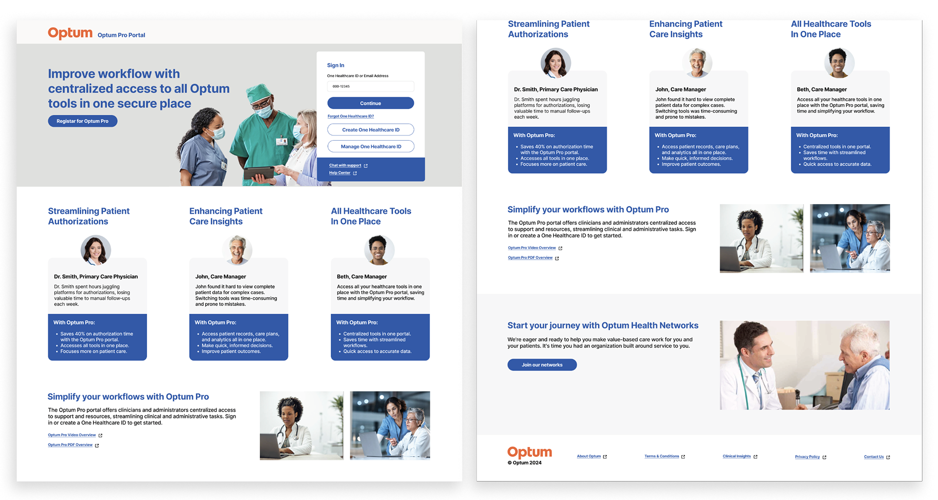
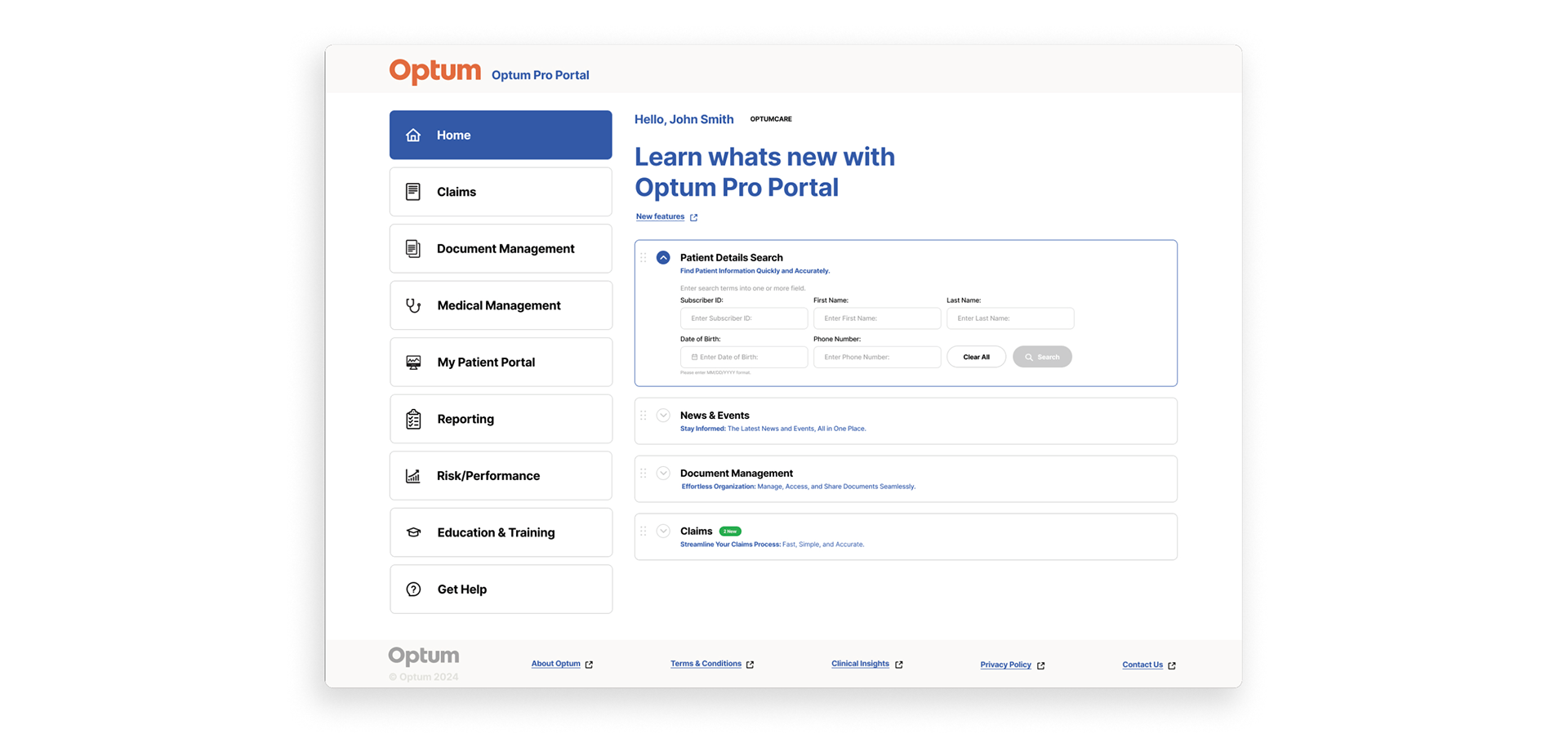
Homepage Design Iterations
Homepage Design Iterations
The homepage design underwent multiple rounds of revisions based on stakeholder feedback — refining layout, content hierarchy, and visual elements to ensure alignment with business goals and user needs. Each iteration brought the design closer to a clear, accessible, and engaging experience for all users.
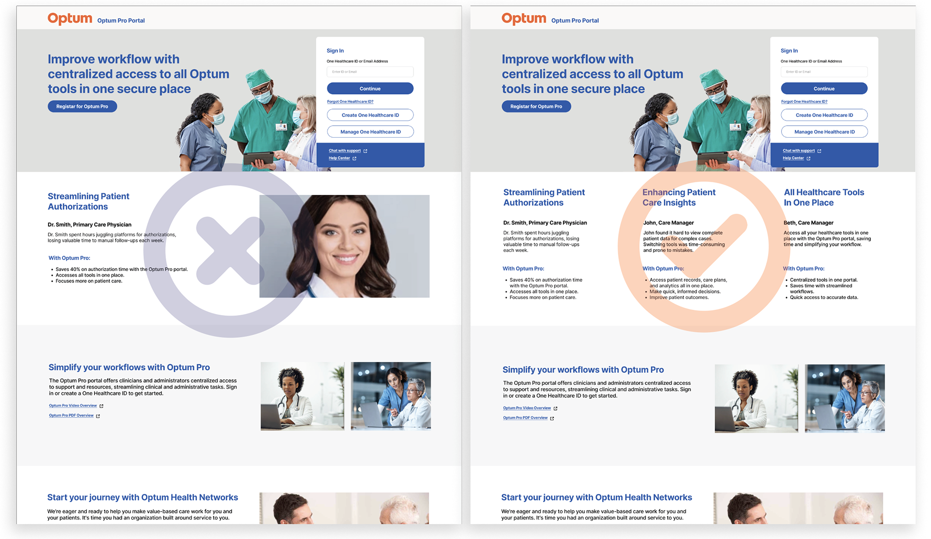
Steakholder Feedback
● Clear headline.
● Strong call-to-action.
● Clean design that highlights key benefits.
Desk Studies & Usability Testing
We conducted small rounds of testing to validate key homepage elements of the Optum Pros Provider Portal.
What We Tested:
Card Components: Ensured users could easily read, understand, and interact with the cards.
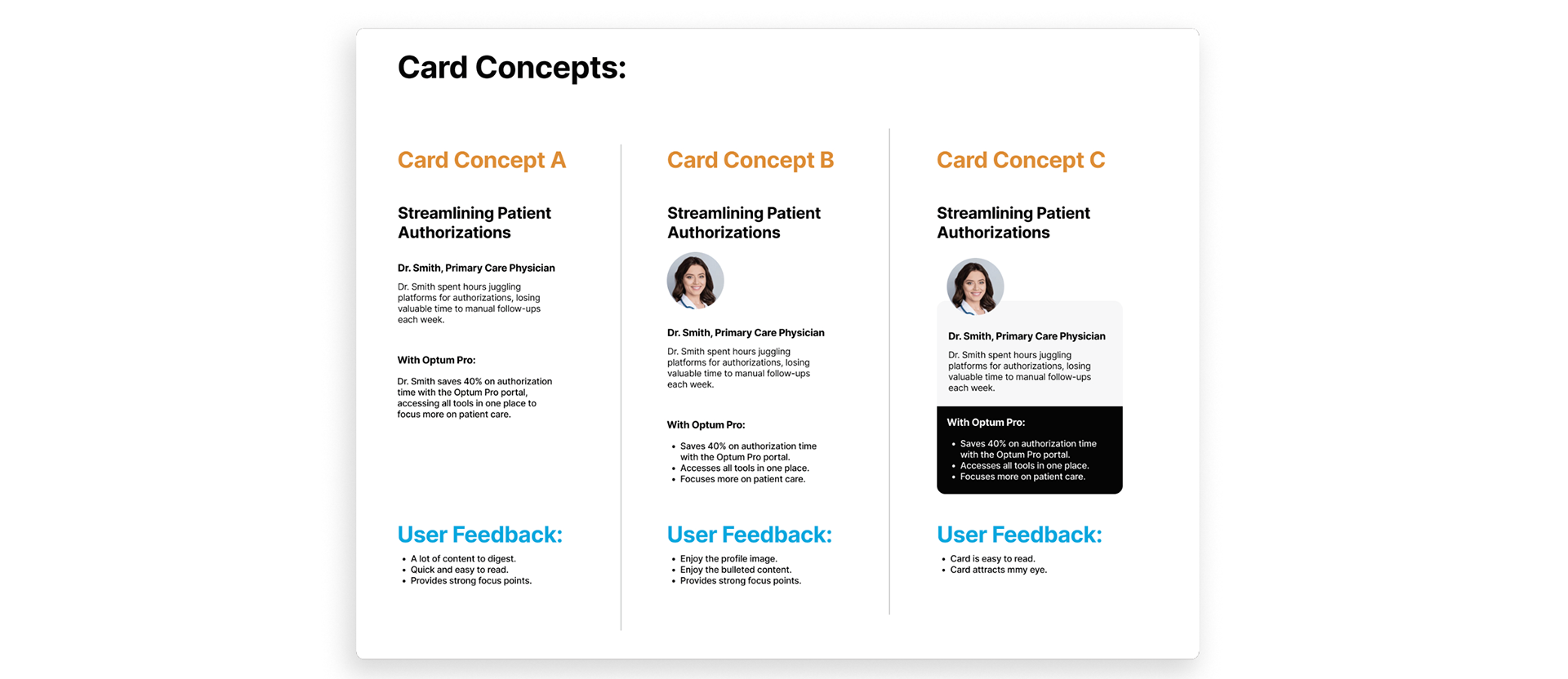
Sign-In Modal: Evaluated the step-by-step login process to confirm it was simple, intuitive, and efficient.
These tests helped refine the design for better usability and a smoother user experience.

Homepage Final Design
After several reviews, the product team and I agreed on the final Optum Pros homepage design. It’s simple, clear, and easy to use. We made sure the most important tools are easy to find, the layout is consistent, and the design meets both user and business needs.
Design Adjustments Based on Feedback
● Clear, attention-grabbing headline
● Strong and visible call-to-action (CTA)
● Clean, uncluttered layout
● Clearly showcases key user benefits
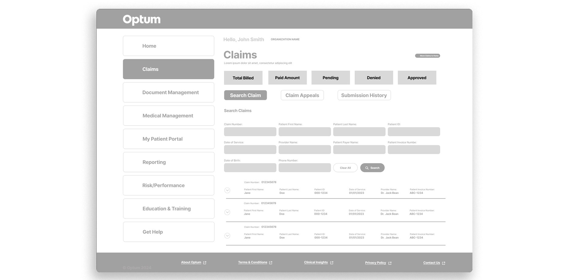
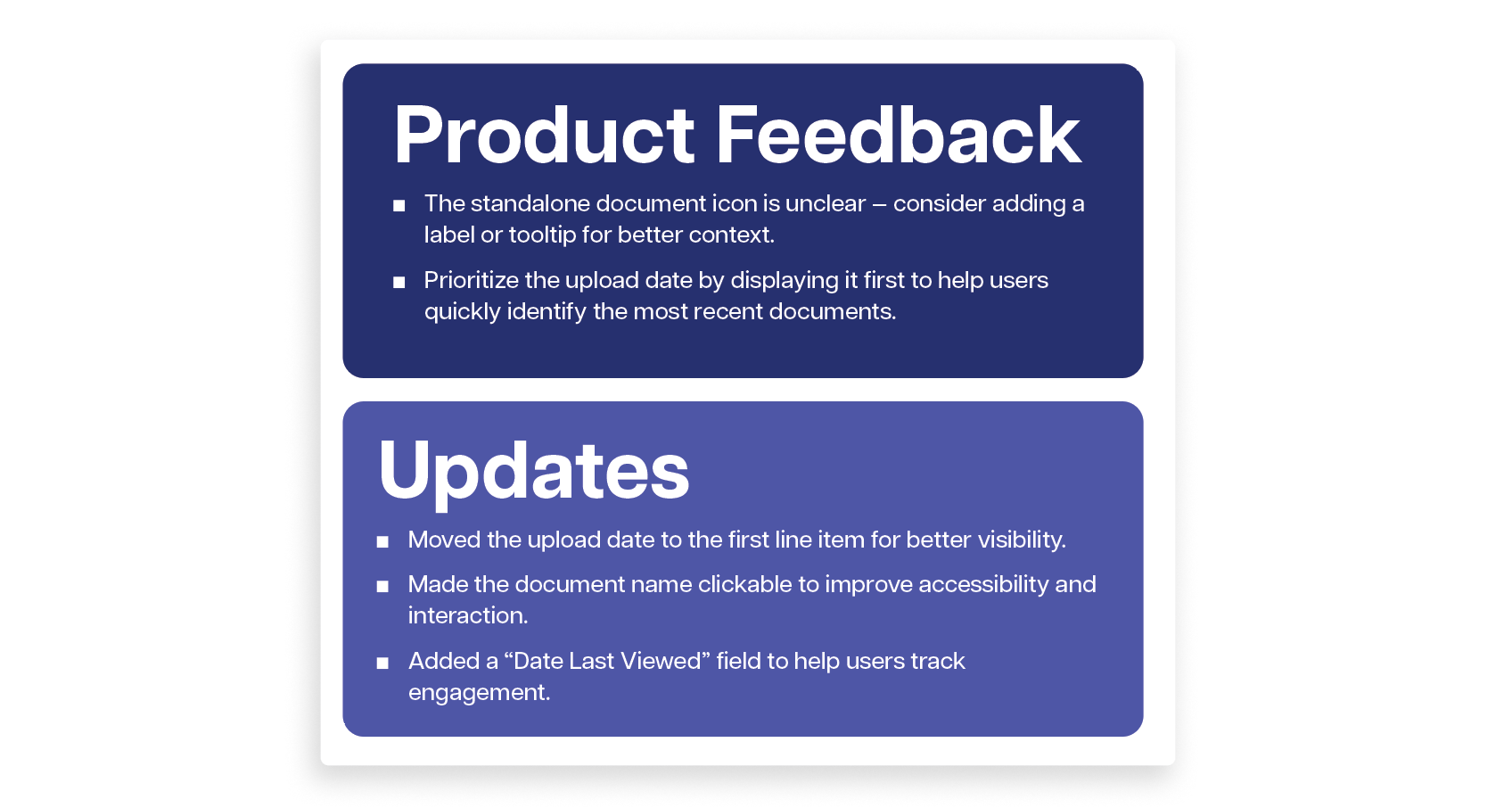
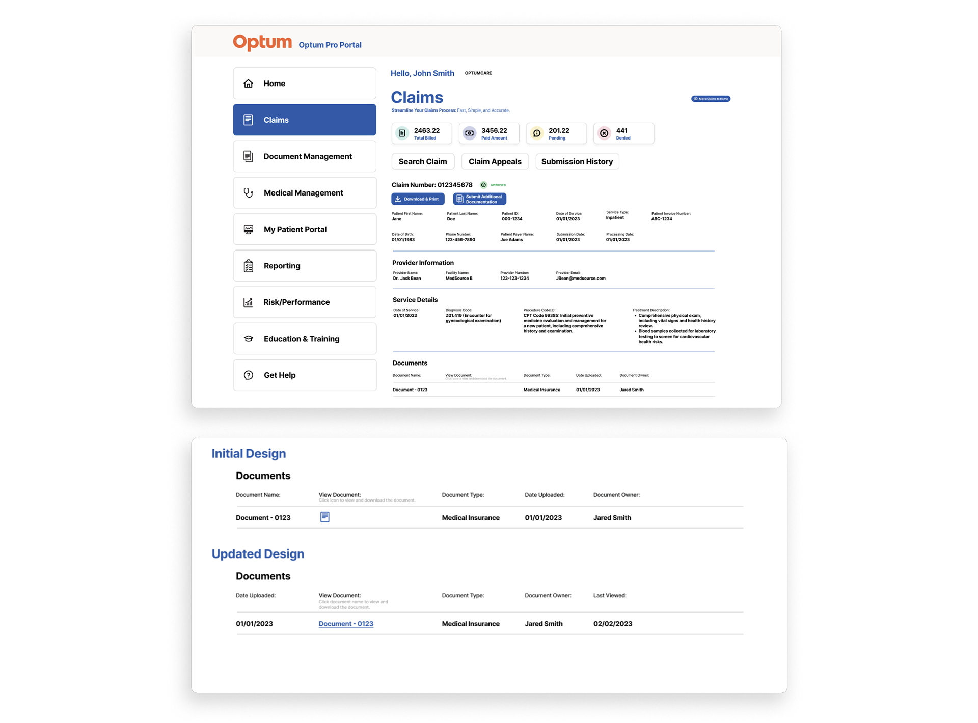
Claims Page Iteration
During the Design and Iteration phase, I translated the business requirements and user needs into initial wireframes for the Claims page. These wireframes were shared with the product team and design partners to gather feedback, align on goals, and refine the design direction.
Wireframe Option A
The initial wireframe was updated to accommodate additional content identified during reviews.
I also designed a scalable layout to effectively display populated claim results and support future data growth.
I also designed a scalable layout to effectively display populated claim results and support future data growth.
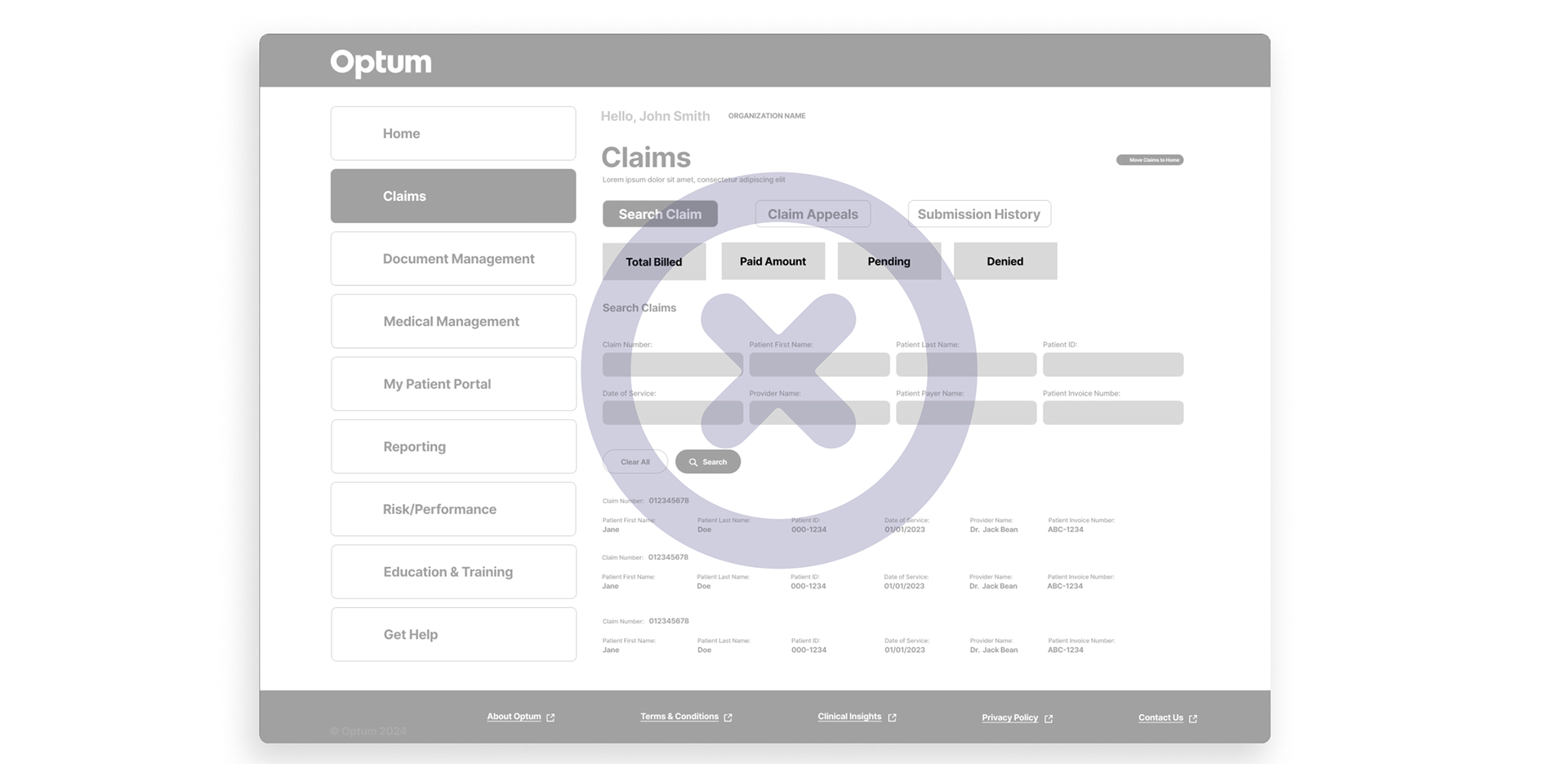
Wireframe Option B
As a result, the next wireframe incorporated the additional content and introduced a scalable design framework.
This allowed for better organization of claim results, improved clarity for users, and ensured the layout could easily adapt as new data or features were added.
This allowed for better organization of claim results, improved clarity for users, and ensured the layout could easily adapt as new data or features were added.
Mockup 1st Round
Detailed visual design showing color, typography, and branding (high fidelity).
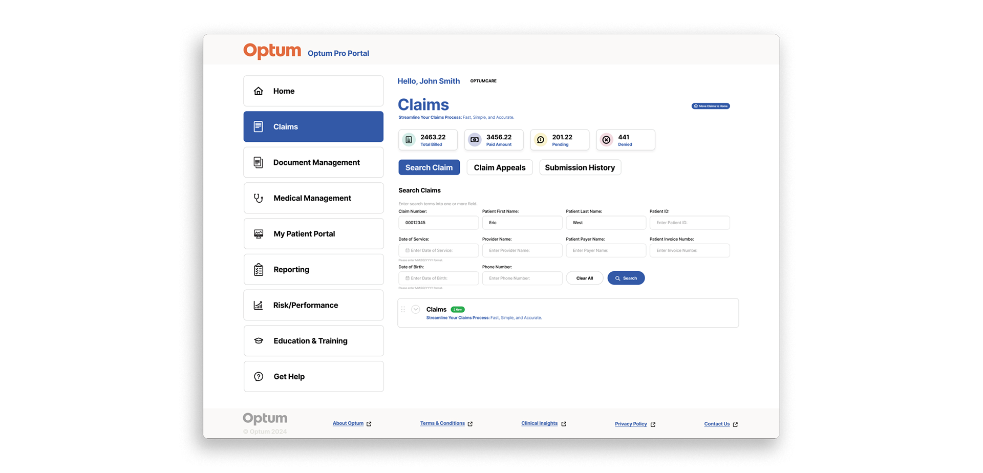
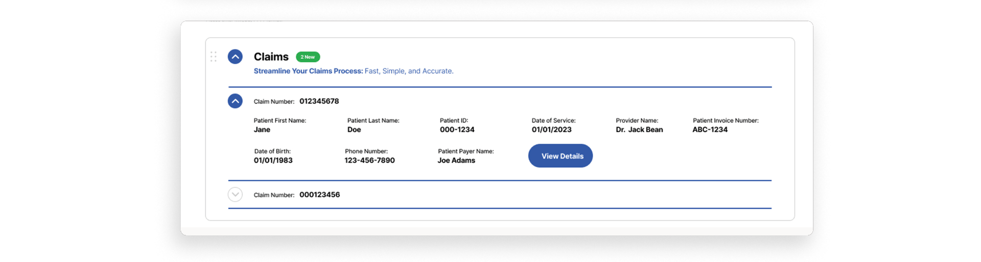
Claim Details Access (Collapsible Section)
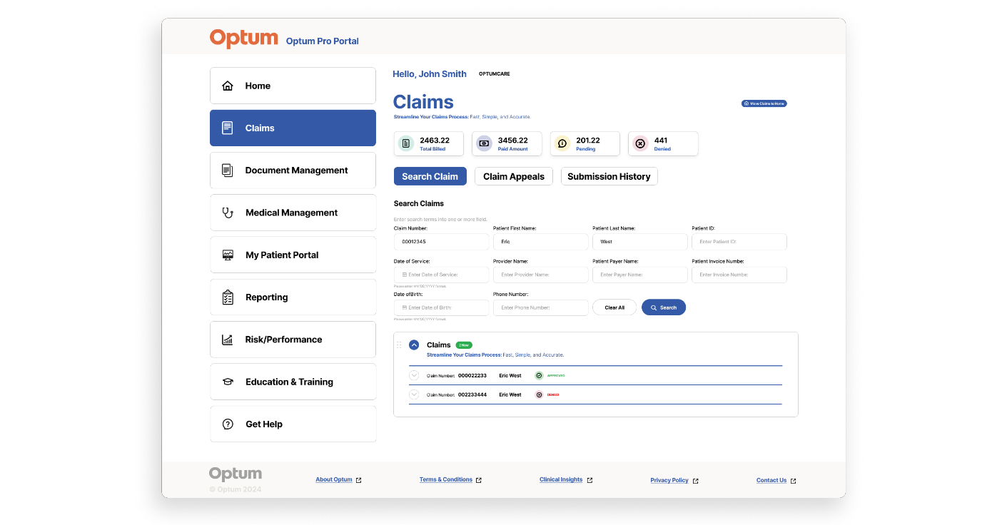
Explore Claim Details (Expandable Section)
Claim Details Page
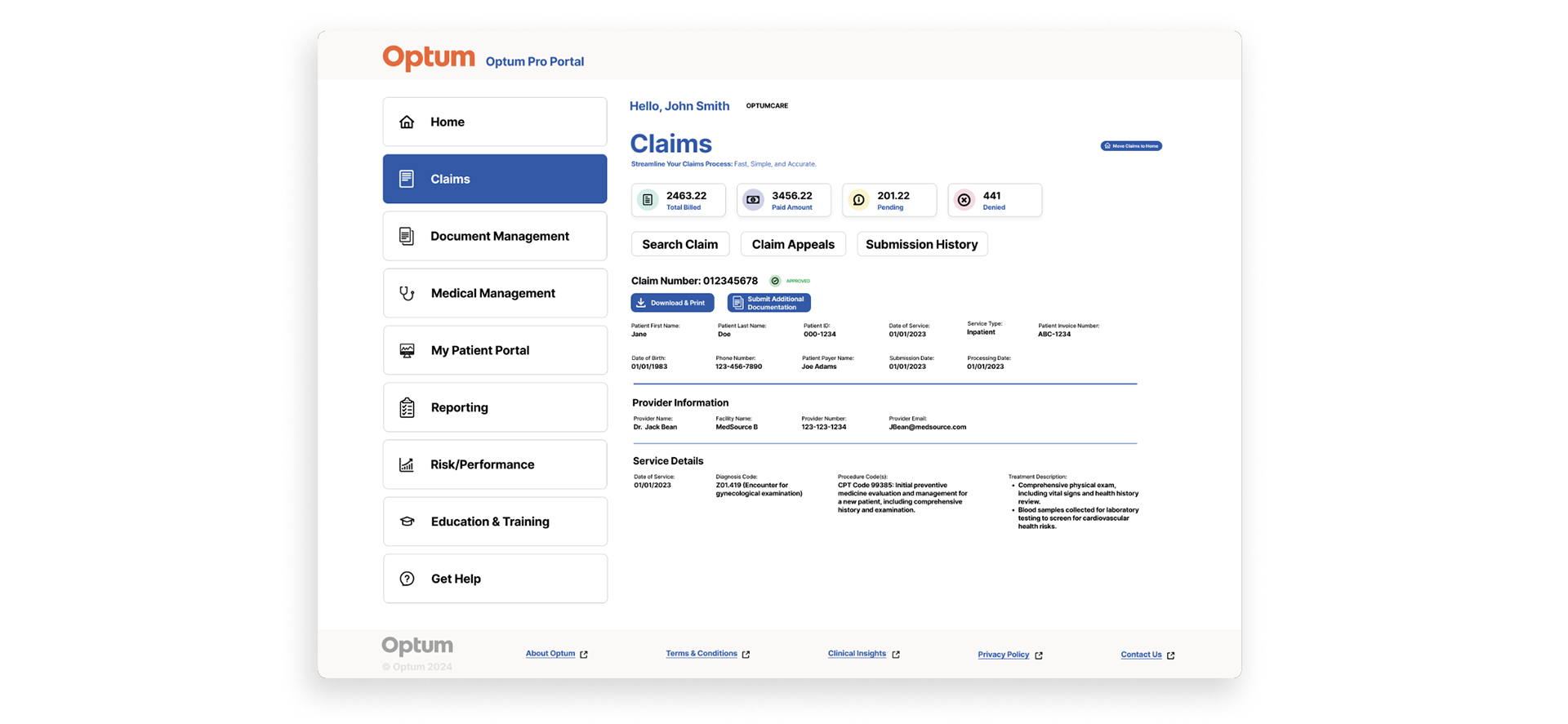
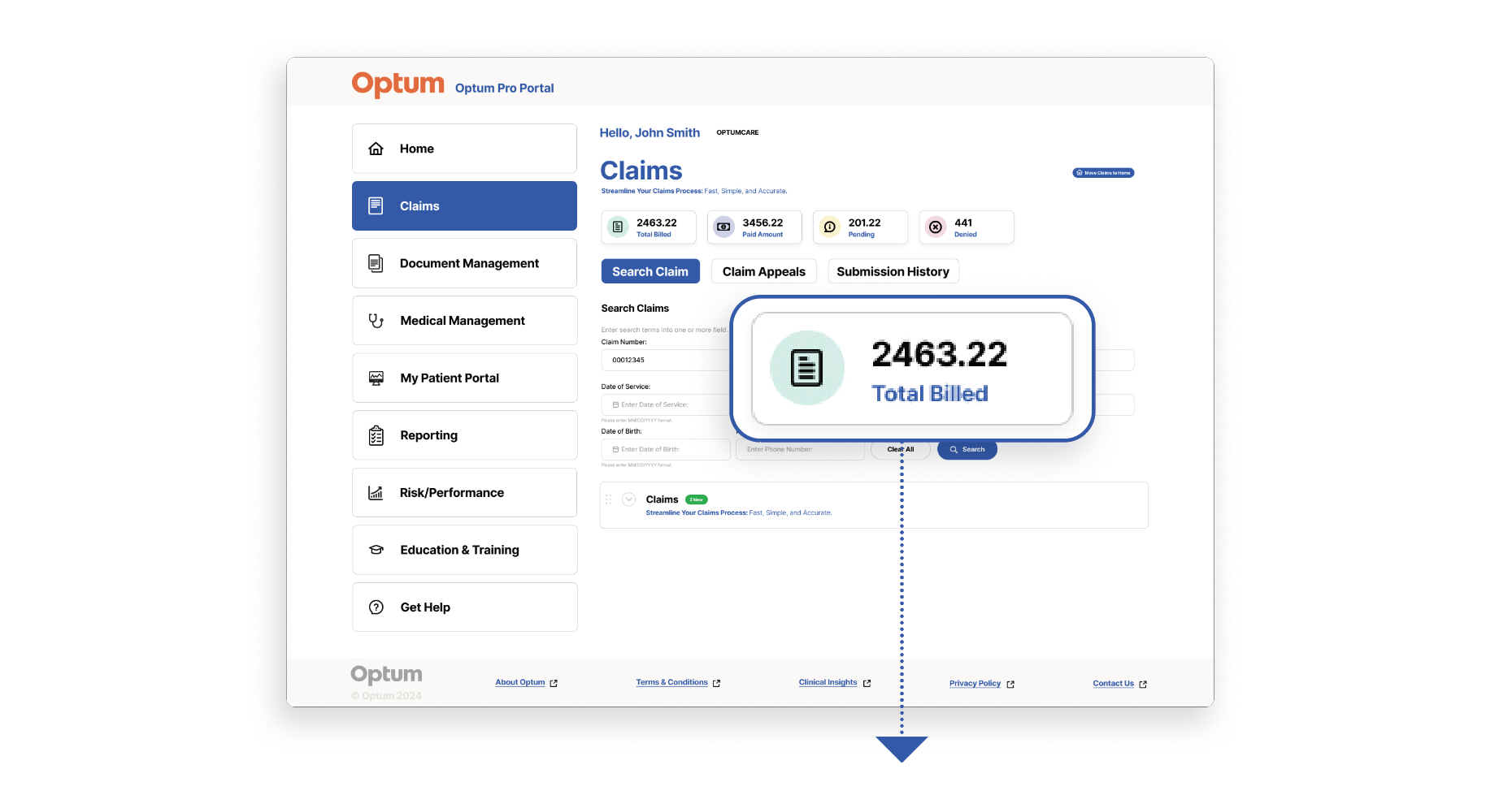
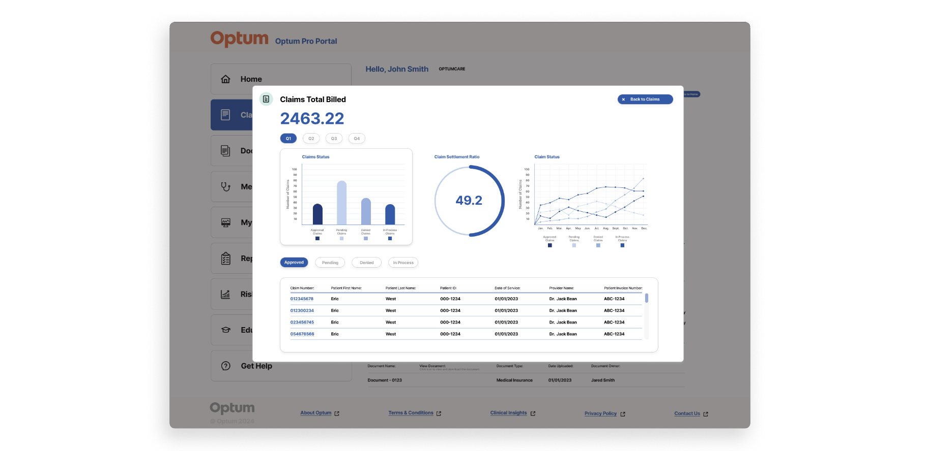
Mockup 2nd Round
Project Pivot: Transforming Static Content into a Dynamic, Data-Driven Experience
During the project, we made a key pivot from a standard content-heavy page to a more interactive and visually engaging design. The original layout relied heavily on text, making it difficult for medical professionals to quickly interpret data or act efficiently.
To solve this, we redesigned the page to include
UX Design Handoff to Developers
1. Design Files
High-Fidelity Mockups: Complete and pixel-perfect designs for all screens and states (desktop, mobile, tablet).
Prototypes: Clickable prototypes demonstrating user flow and interactions.
2. Design Specifications
● Spacing, Padding, and Alignment: Margins, padding, and alignment details for layout consistency.
● Color Codes: Hex, RGB, or HSL values for UI colors.
● Typography: Fonts, sizes, weights, and styles (e.g., headings, body text).
● Iconography: Icons, their sizes, and usage guidelines.
● Component Details: Description of reusable UI components (e.g., buttons, cards, modals).
3. Interaction Details
● Microinteractions: Descriptions of hover states, click behaviors, and transitions.
● Animations: Motion specifications, such as duration and easing curves.
● Responsiveness: Breakpoints and how designs adapt across devices.
6. Assets
● Exported Assets: Images, icons, and illustrations in developer-friendly formats (e.g., SVG, PNG, or JPEG).
● Design Tokens: Variables for consistent implementation of colors, fonts, and spacing.
7. Documentation
Design System/Style Guide: Comprehensive documentation of UI components and patterns.